Jump To
Start
Research
Design
Outcomes

Librate
Research and Design Project
What technological interventions can make lawyers live easier and their workload more efficient?

No time to ready the whole case study and just want to cut to the chase?
Problem Statement
Law firms lose hundreds of billable hours to simple repetitive tasks, and junior lawyers to burnout, what automation and data visualisation interventions exist to lessen this.
Project Plan
Project Resources
Team
Resources
Time-frame: 2 months
Team
- Myself, UX/UI Designer, UX Researcher, Front End Developer
- CEO - Project Manager
- Backend Developer - Build python functionality and consult on project requirements
- Junior UX Designer - Assist with wireframing and style guides
Resources
- User Interviews
- Personas
- Empathy Mapping
- Figma - Mock Ups and Interactive Prototyping
- Blockly - Front end of interface
Time-frame: 3 months
- Month One Research and initial wireframes. Focus on Document Aspect of problem
- Month One Design and Development. Focus on Document Aspect of problem
- Month Two Research and Design of Dashboard
What is the project?
On commission of a partner at a large london-based lawfirm, we were tasked with exploring two potential technology interventions to address their firms pain points.
The first, automated legal document generation, turning pitchdecks into verification notes and machine learning based tools to assist in document clean up and maintenance.
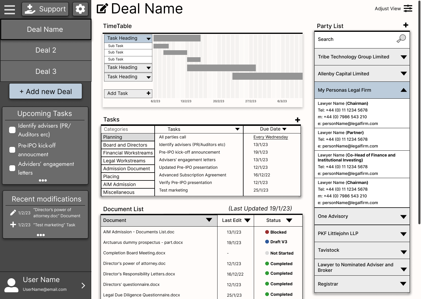
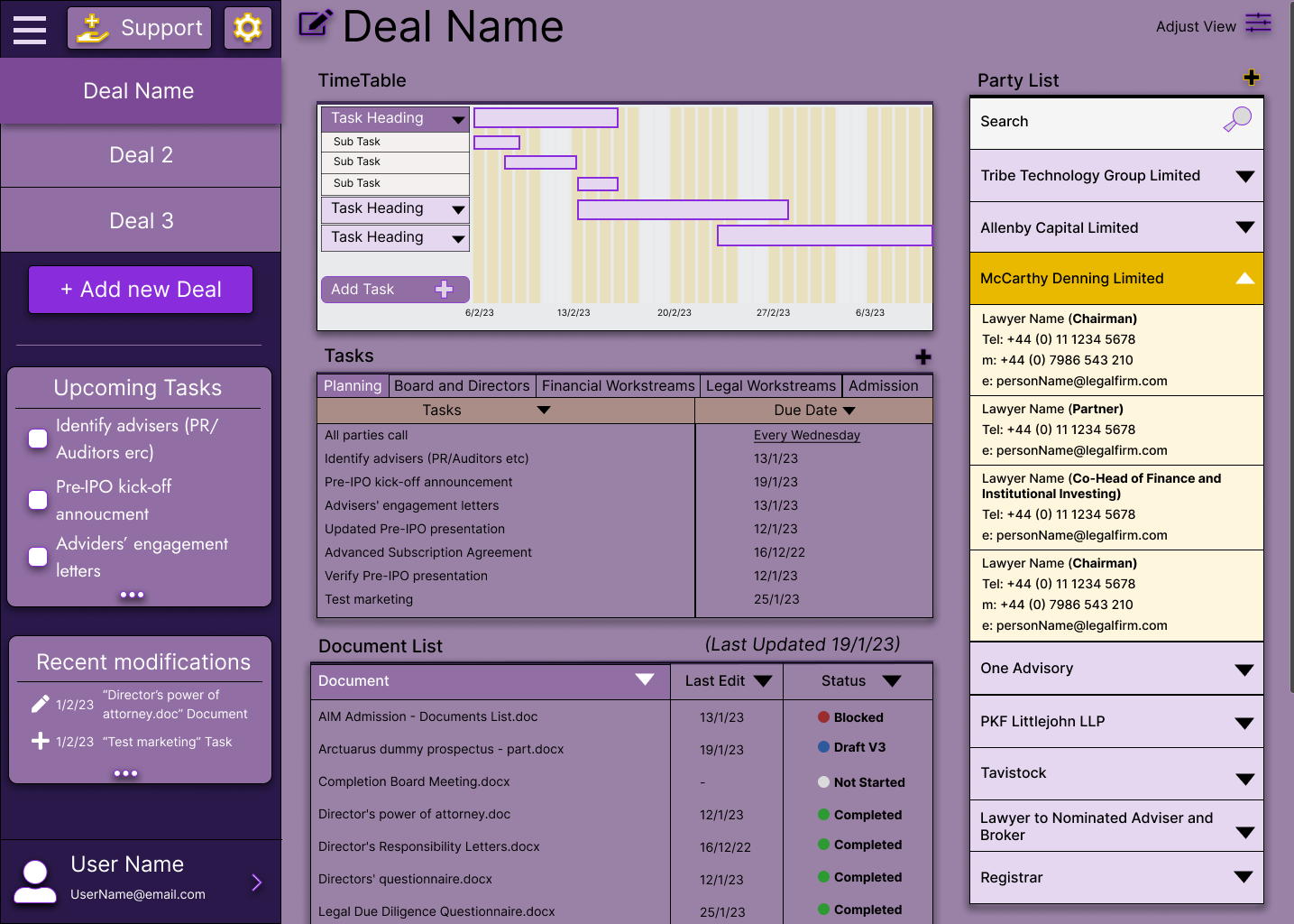
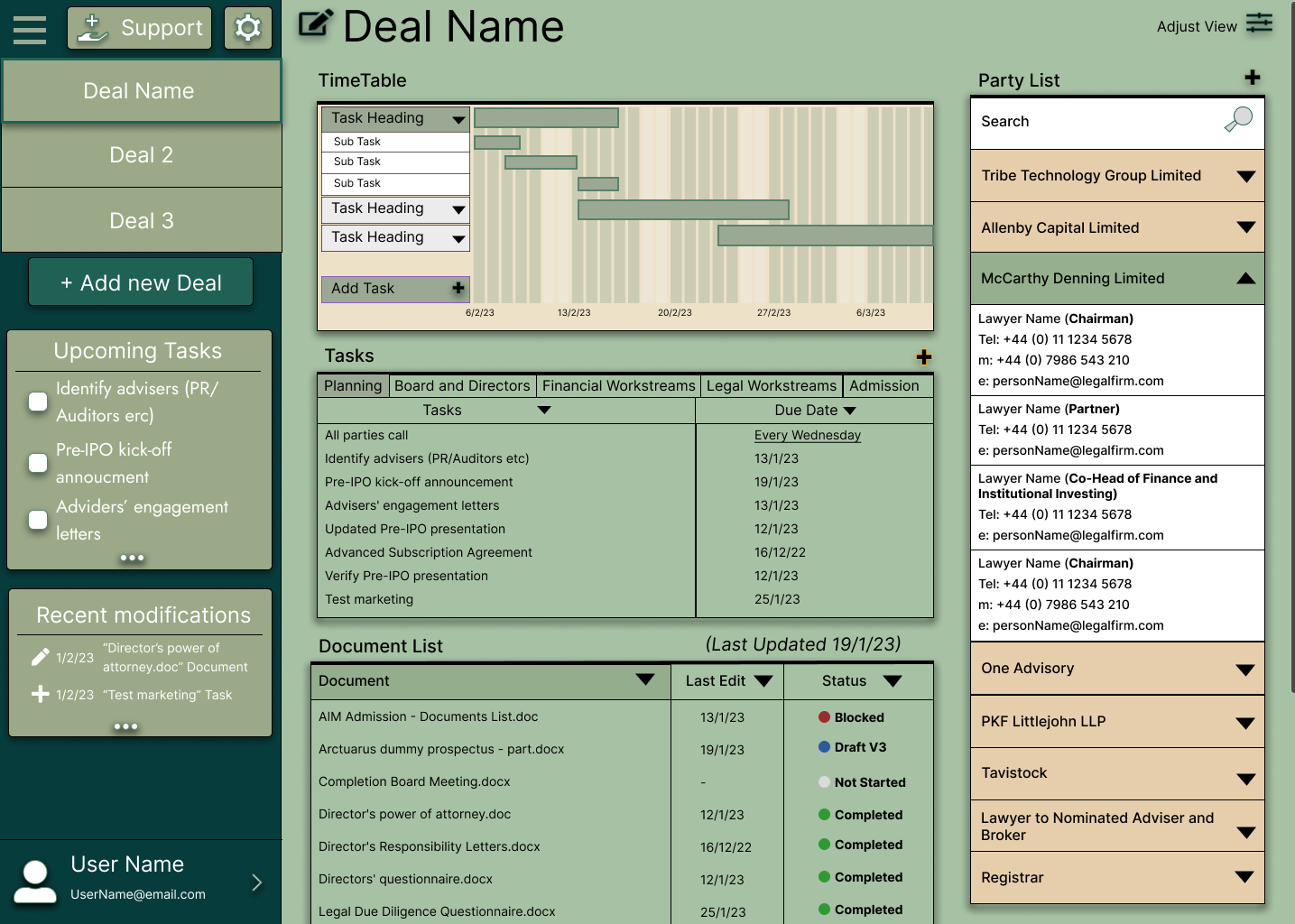
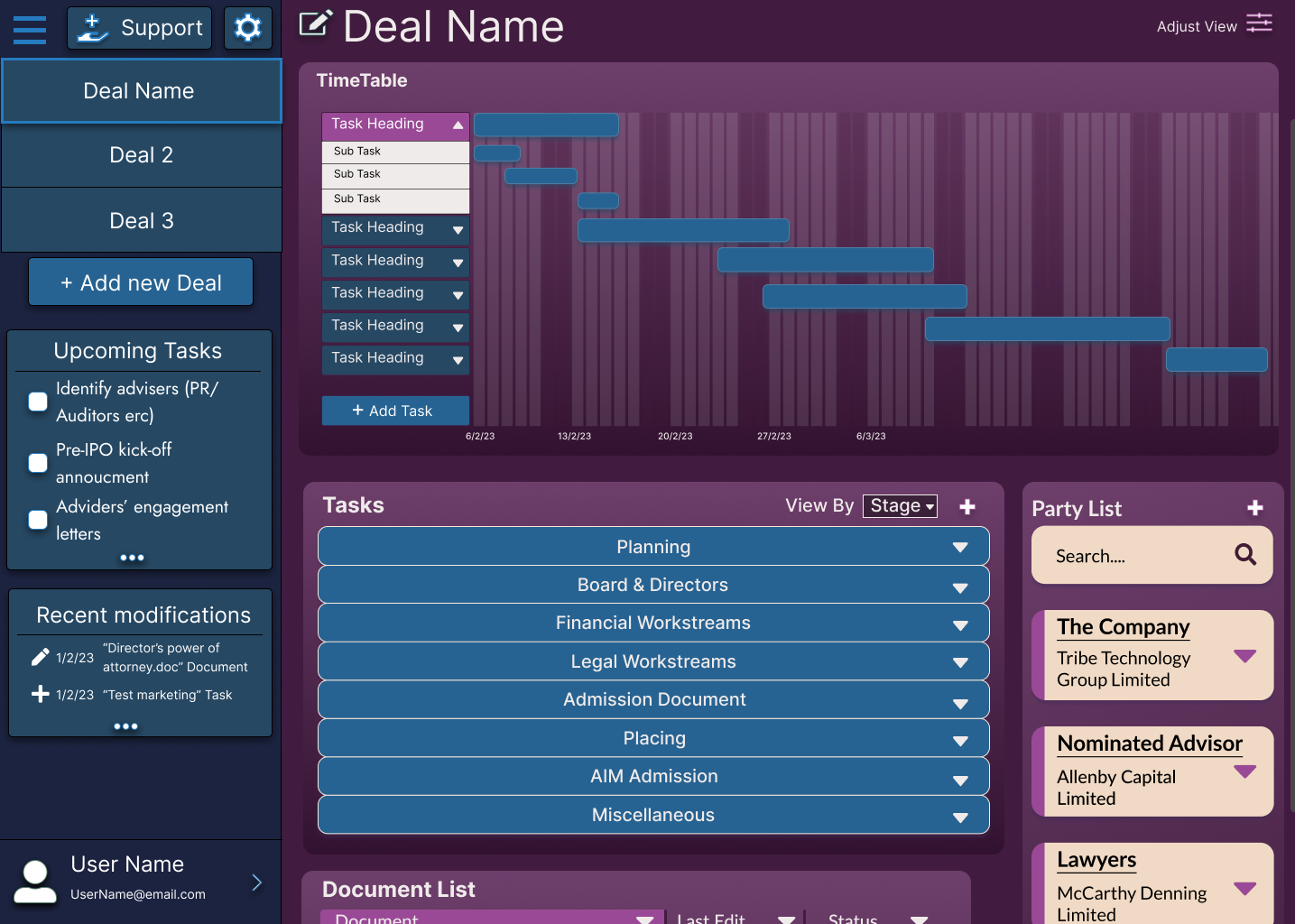
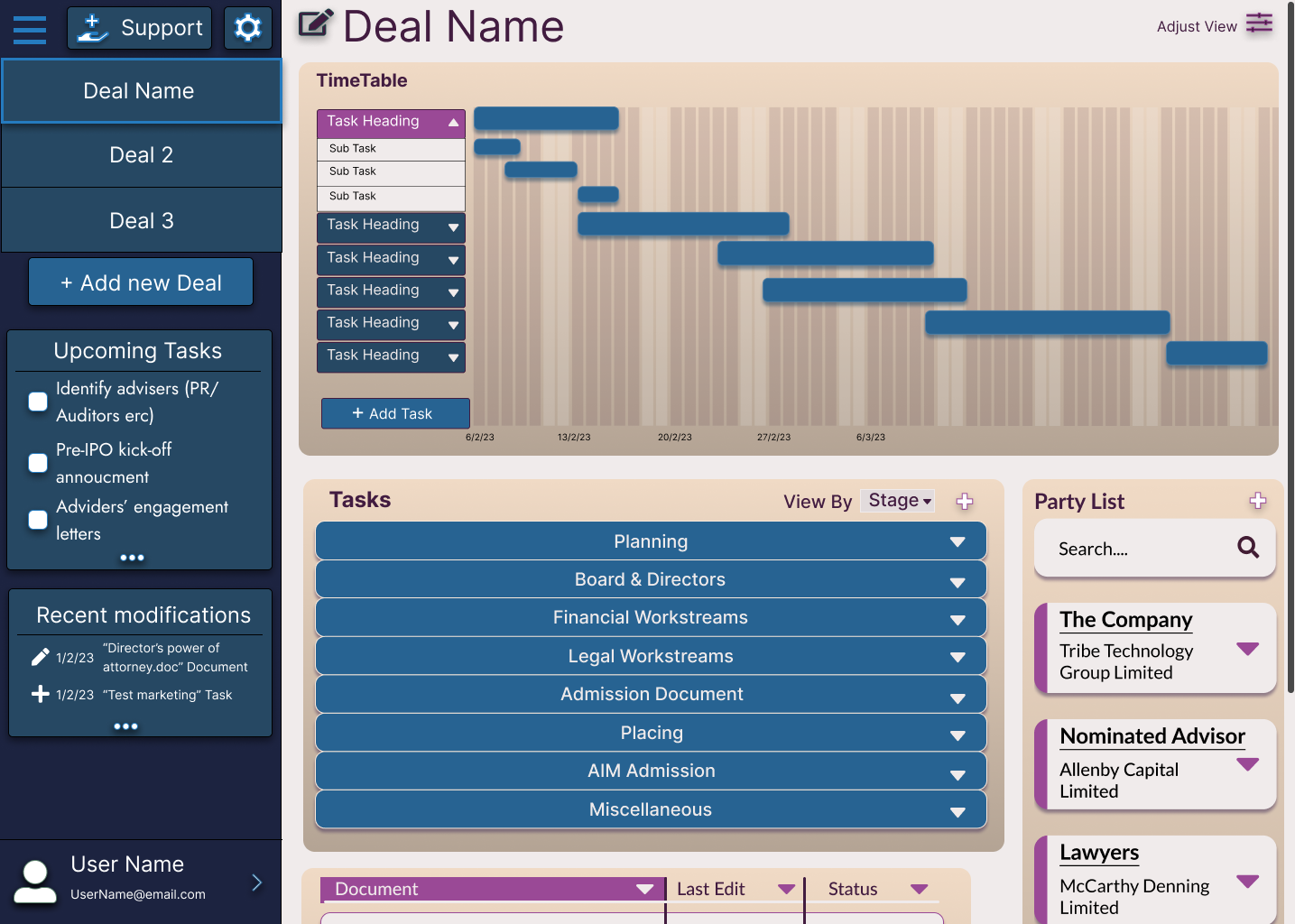
The second, a legal dashboard, exploring how a cloud-based law firm can store information on deals in a single easy to use dashboard of information
Exploration and Discovery
Initial User Interviews
Over a series of video calls, I met with a partner from the law firm to better scope the pain points they were looking to address.
- Repetitive Tasks - Lots of legal document creation is simply changing the same information over and over again
- Loss of Billable Hours - Time spent on amendments and making required changes to files is often not billable, leaving lawyers working longer hours for less money
- Poorer working conditions for junior lawyers - As the repetitive tasks are harder to bill, and less enjoyable, this work can often fall to junior lawyers, delaying their career progression by leaving them with 'scut work'
Task Walkthroughs
Due to the unfamilar sector, I asked the partner to talk me through what the average process looked like for instances such as producing verification notes for a clients pitch deck, or changing the business address of a client.
“Something as easy as adding a clients middle name, a really common change, can take up to two hours as we have to search every document which can be 200+ pages. No amount of control f or replace all can really speed this up since we have to make sure it's accurate”
Personas
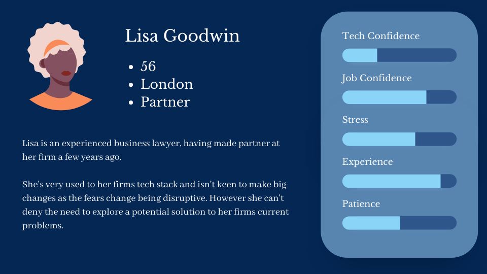
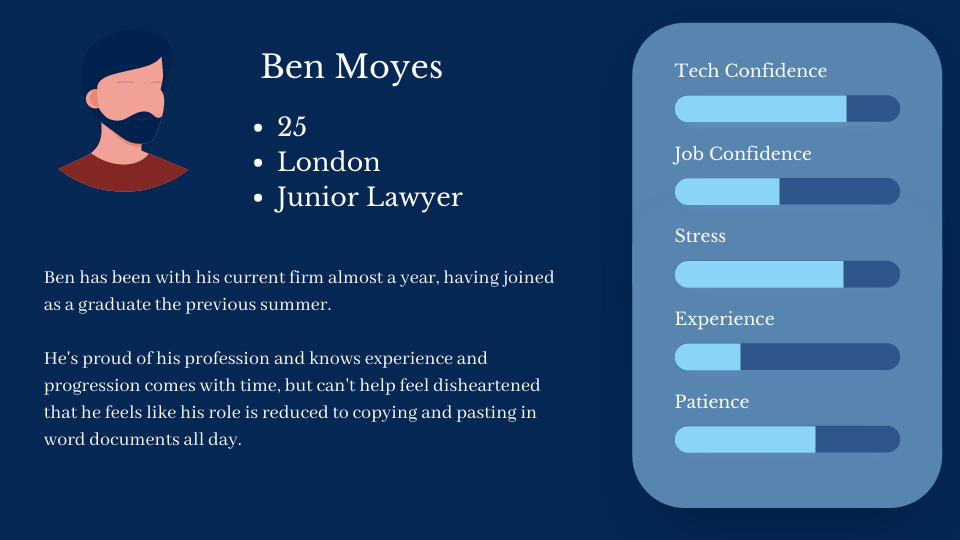
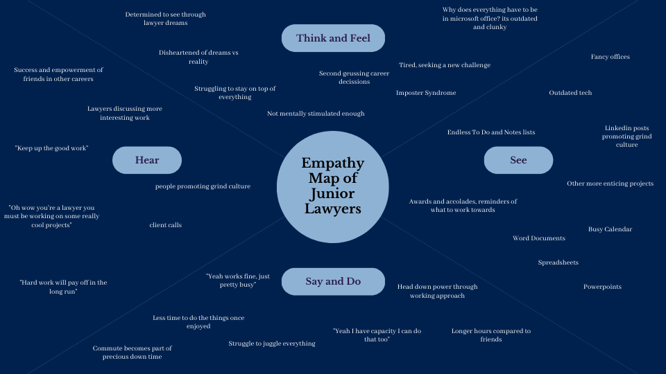
To better understand the perspective of junior lawyers, as interviews were conducted with a senior lawyer, an persona and empathy map were generated to ensure their pain points were also addressed.
UX Design
Working with Microsoft Office
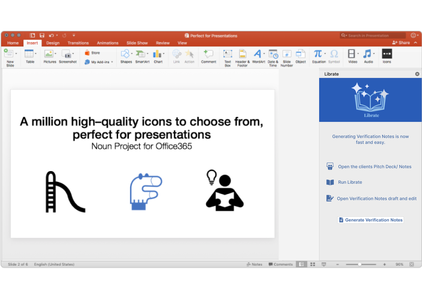
Part of the solution to the various pain points involved legal document generation produced from python. While this improved speed and removed repetitive tasks, it was clear the documents would never be perfect, and I therefore had to create a front end system of 'Add-ins', micrsoft extensions.
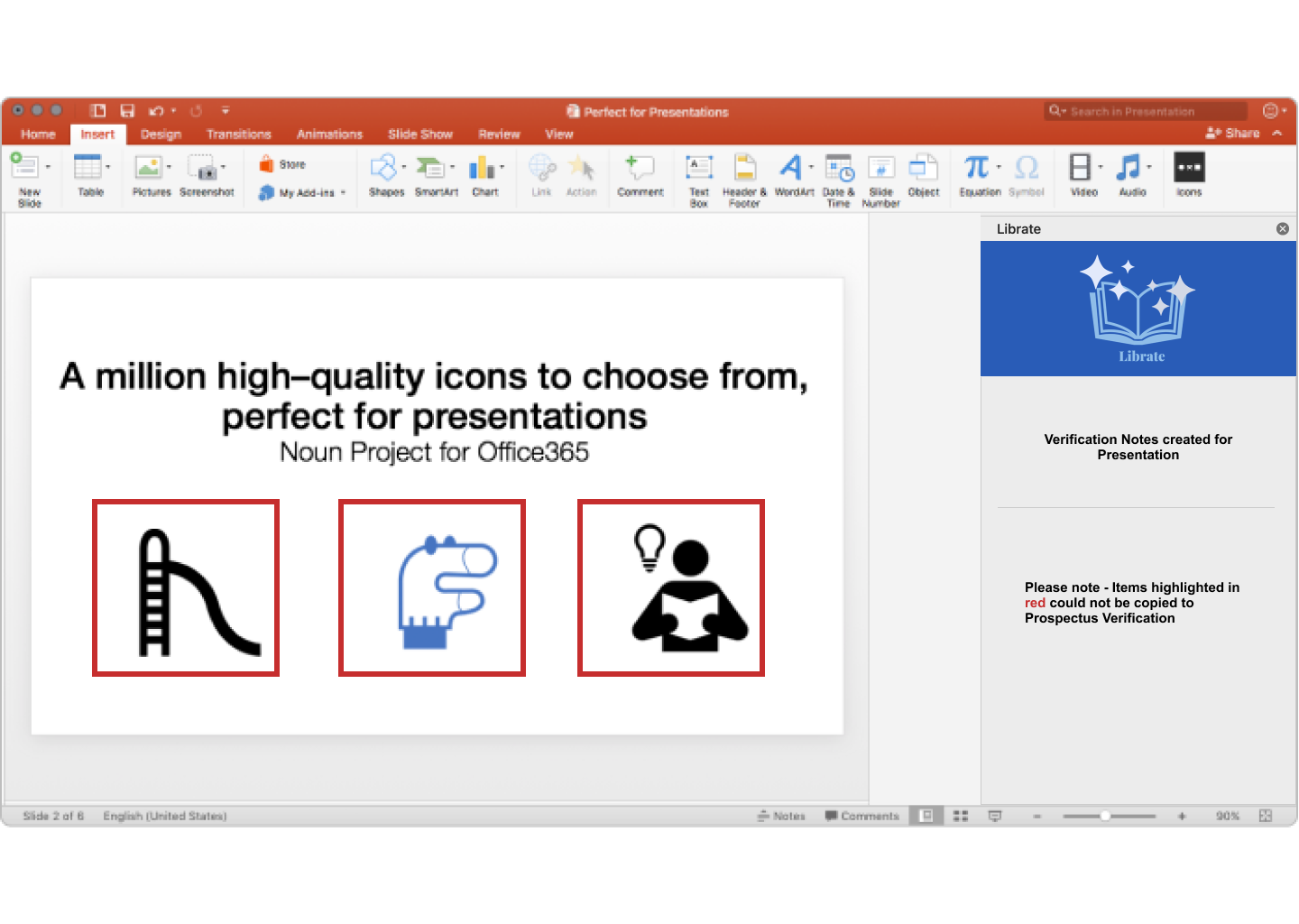
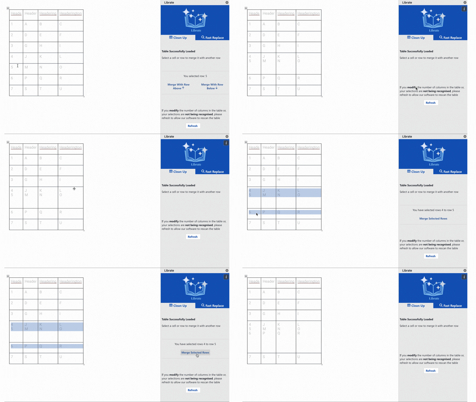
- Merging of Tables - The generated document sometimes seperates verification notes which should be one entry
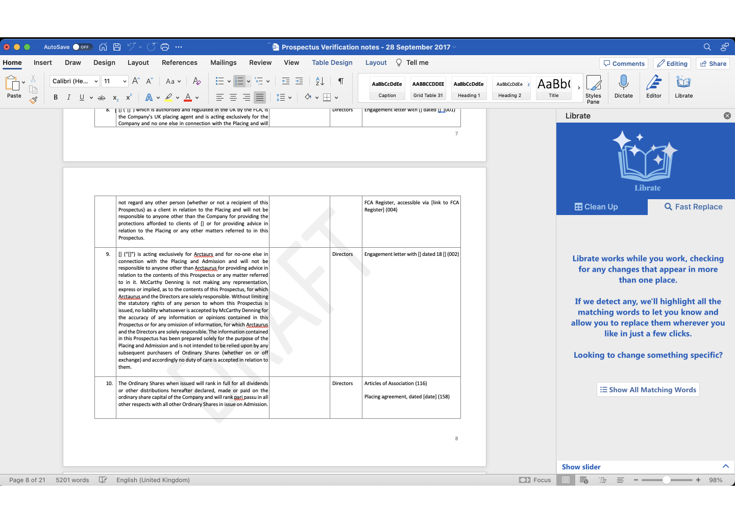
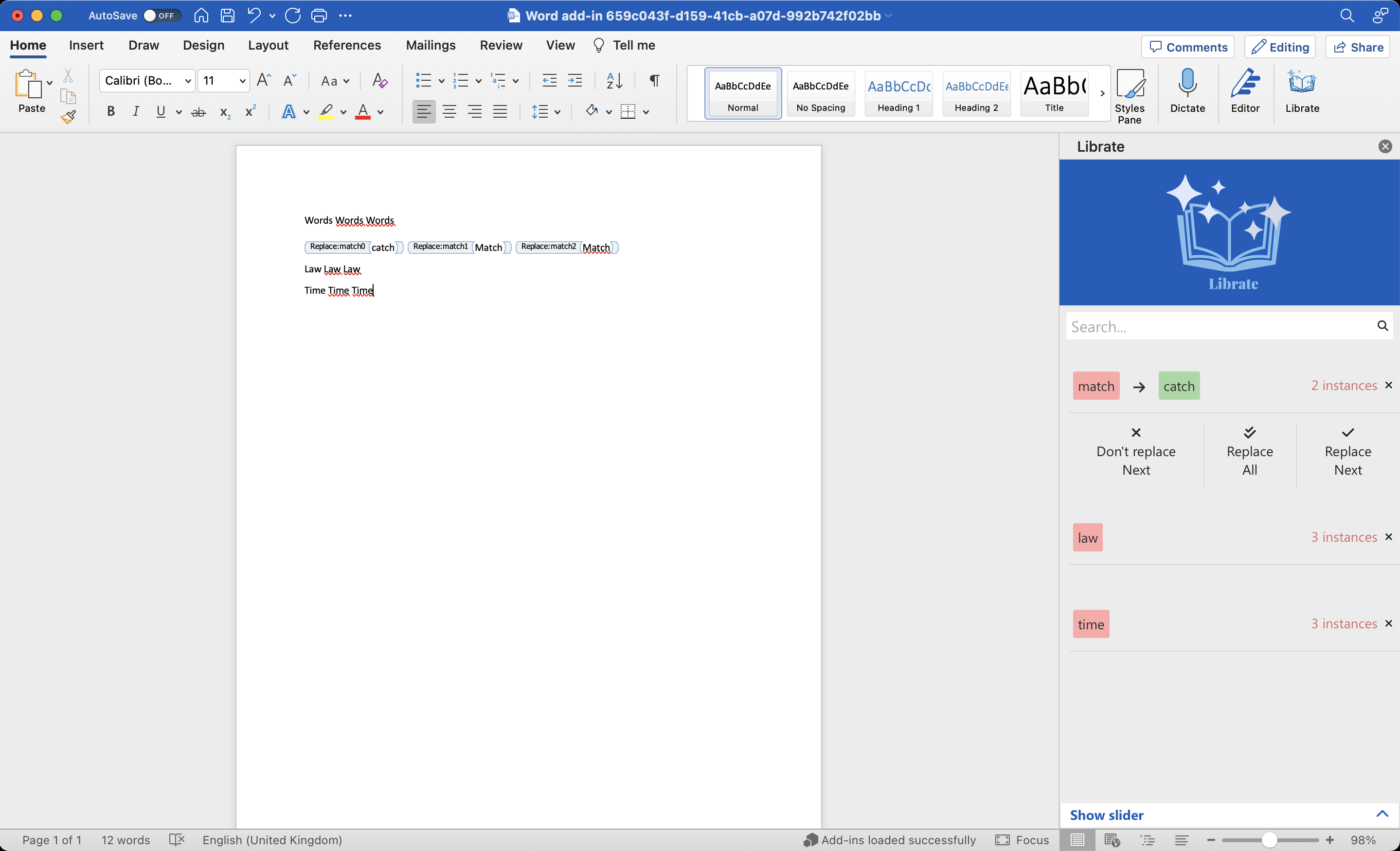
- Replacing Content - The system can't yet address how to replace content. The add-in needs to detect words with multiple uses, and prepare them to trigger a replace all prompt
Word Add Ins
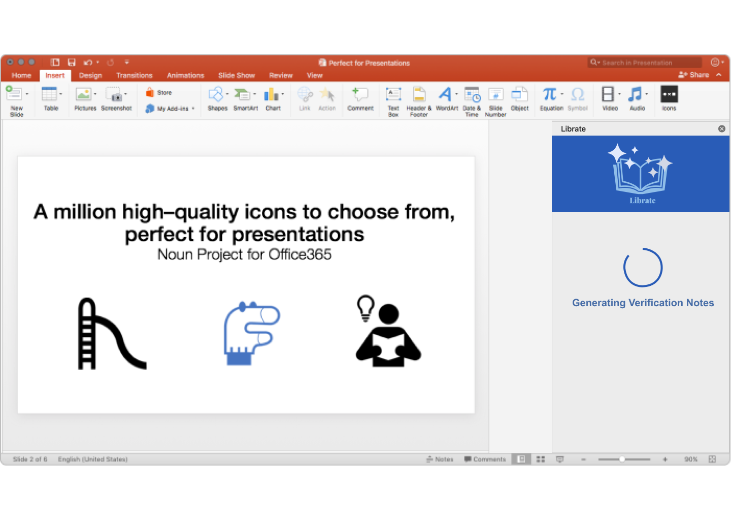
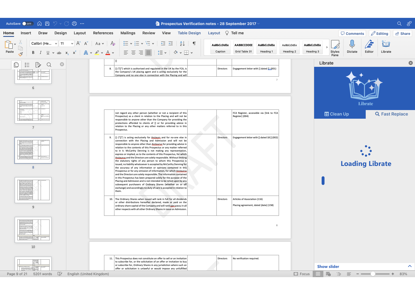
To fit in with the exisiting ecosystem of the firm, I first focussed on what could visually fit within the miscrosoft office style of 'add-ins', side panels added to applications to provide additional services. These were not intended to be overdesigned, but instead to blend in with the existing microsoft ui.
Dashboard Design - High Fidelity
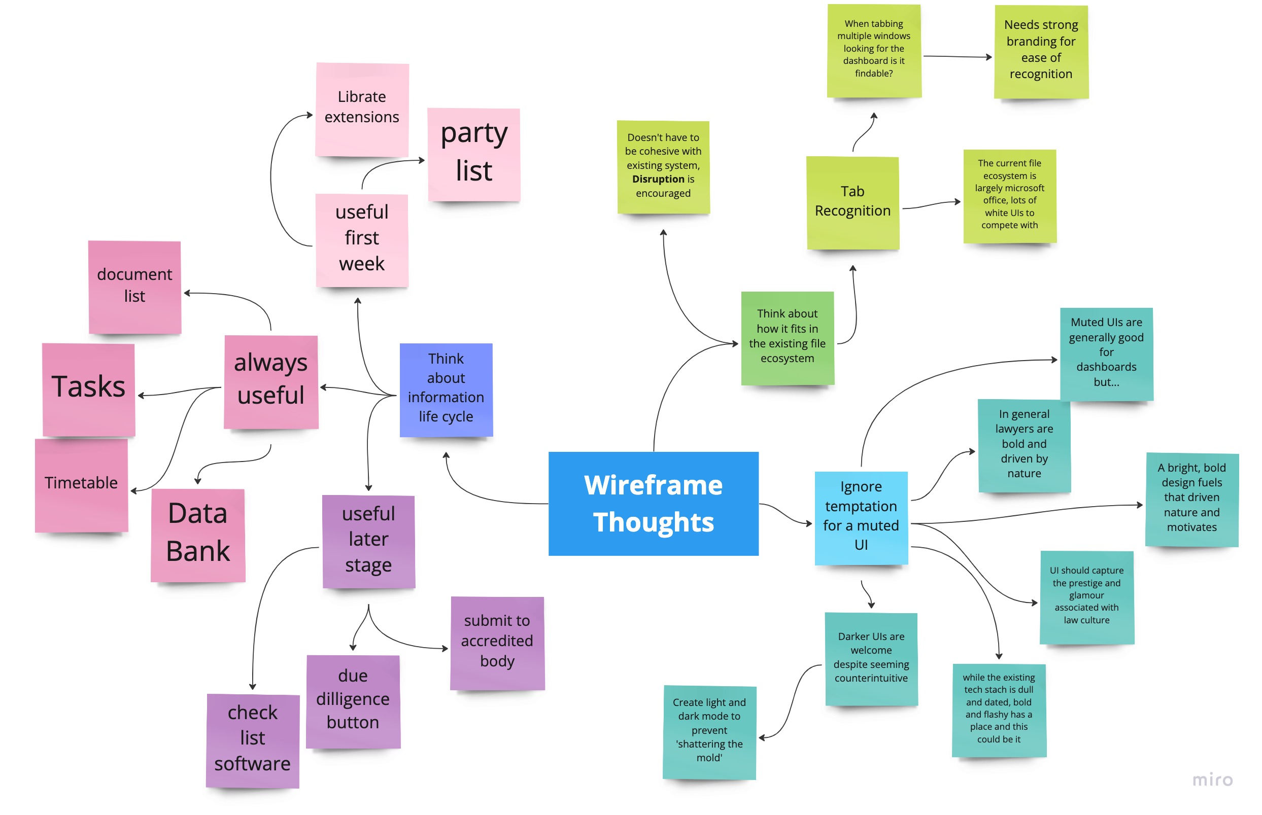
Following consultation with the stakeholder, the concept was expanded into a higher fidelity prototype, to design a system that was visually pleasing and helped convey the feelings of respect and trust essential for a law-tech product.
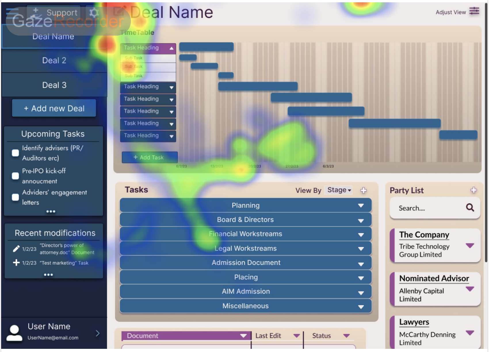
User Test - Eye Mapping
In order to narrow down to a final design colour pallete, style and overall appearance, I used eye mapping as part of user testing. This was selected to check how effective the dashboard was at its main goal, consolidate and highlight key data in one central location, i.e. can users find what they're looking for at a glance?
This allowed a problem with finding buttons and clickable elements to be highlighted early, and allowed the design to be refined for a final prototype.
Final Design
Insights
I knew from the start of this project I would not see the end of it due to contracts. As such, I had to measure success differently.
- Document generation is now easier to implement and easier to manually clean - Developer perspective of the microsoft add ins
- The design is bright, bold, and maintains the high society feel associated lawyers - Clients opinion of prototyping and design files
- The design is intuitive, easy to navigate and I can quickly find lots of key information - summary of user testing data from client calls and eye mapping tests
- There is a clear, easy to follow design system in place - Business perspective on maintaining and expanding the designs into a full service
What I learned
This project was refreshing in allowing me to abandon all assumptions and embrace not knowing things due to the very different industry. Working closely with a stakeholder and their colleagues allowed me to be more open to critiques and nitpicks, pushing and elevating my designs further to exceed their expectations.
I am proud of this project, as it required two drastically different UI's, one to blend in with a very recognisable product and another to be bright, bold and high class whilst retaining ease of use. It also allowed me to have fun and try styles I wouldn't usually opt for. I am proud of the final prototypes I developed, and I hope they will serve the clients well when they enter development.
