Jump To
Start
Research
Design
Outcomes
ArcTaurus Bot Builder

Redesign a no-code automated trading platform to be as usable as possible for traders regardless of their coding knowledge
No time to read the full case study?
My Role
UX Designer
UX Researcher
Front end developer
Design mentor
Team
Business owner
2x Back end developers
Junior UX designer
Marketing
Timeline
9 Months from joining to launch
Impact
Time til user's confidence self serving reduced by
92% (approx 25minutes to 2minutes)
Reduced average bot build time from
15minutes to 2minutes
Problem Statement
How do you create a no code tool that is complex and customisable yet usable for non-programmers?
Additional Problems and Considerations
- THIS IS NOT FINANCIAL ADVICE – due to the risks involved with investing and trading and the strict laws surrounding such industries, while teaching people how to use the platform we could not encourage or recommend any strategies. For example, the obvious solution to explaining how to start building a strategy would be to walk them through it, however legal advice strongly discouraged this due to fears even showing what blocks to use could construe as endorsing a particular investment
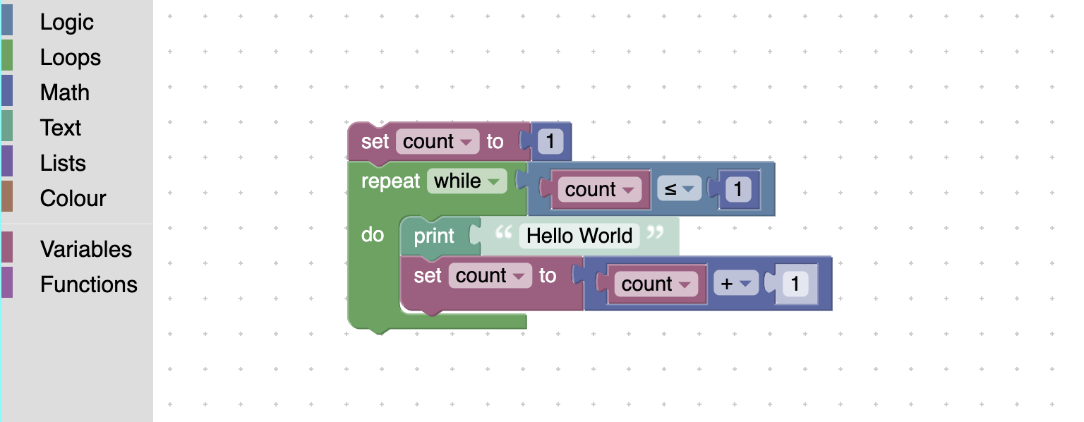
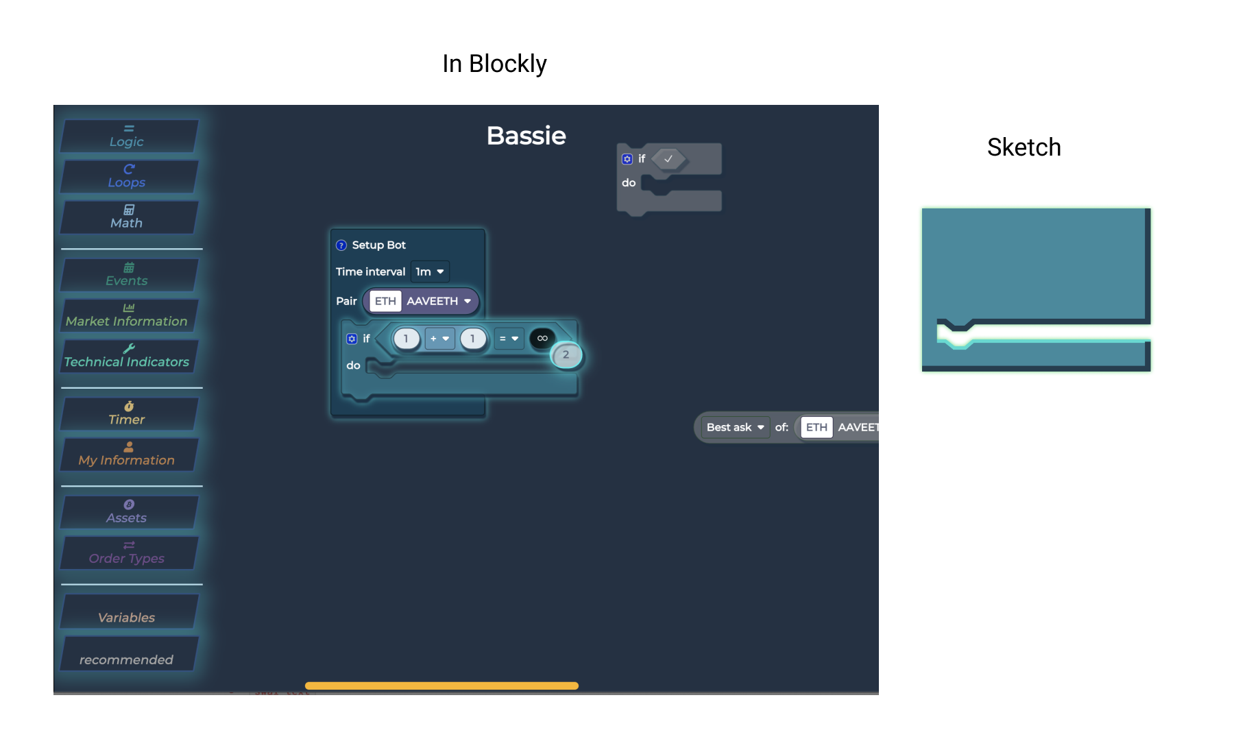
- BLOCKLY – Due to the time already invested learning the Google Blockly platform for the back end, I was instructed not to change from this client-side library. This presented many challenges, as the UI is tricky to customise especially with block shapes
Project Resources
Team
Resources
Time-frame: 9 months
Team
- Myself, UX/UI Designer, UX Researcher, Front End Developer
- CEO - Project Manager, front and back end development
- 2x Backend Developer - Construct functionality of product
- 2x Marketing - Consult on brand guidelines and style guides
- Junior UX Designer - Focus on responsiveness of designs
Resources
- User Interviews
- Task Walkthroughs
- Adobe Photoshop/Illustrator - Concept art and additional graphic creation
- Figma - Mock Ups and Interactive Prototyping
- Blockly - Front end of interface
Time-frame: 9 months
- Months One - Two Market research, Scoping project and initial user interviews
- Months Three - Five Onboarding Design and Development. User Testing Onboarding
- Months Six - Nine Design and Development of Split Screen and other feature fixes.
What is the product?
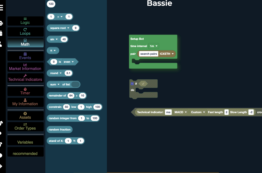
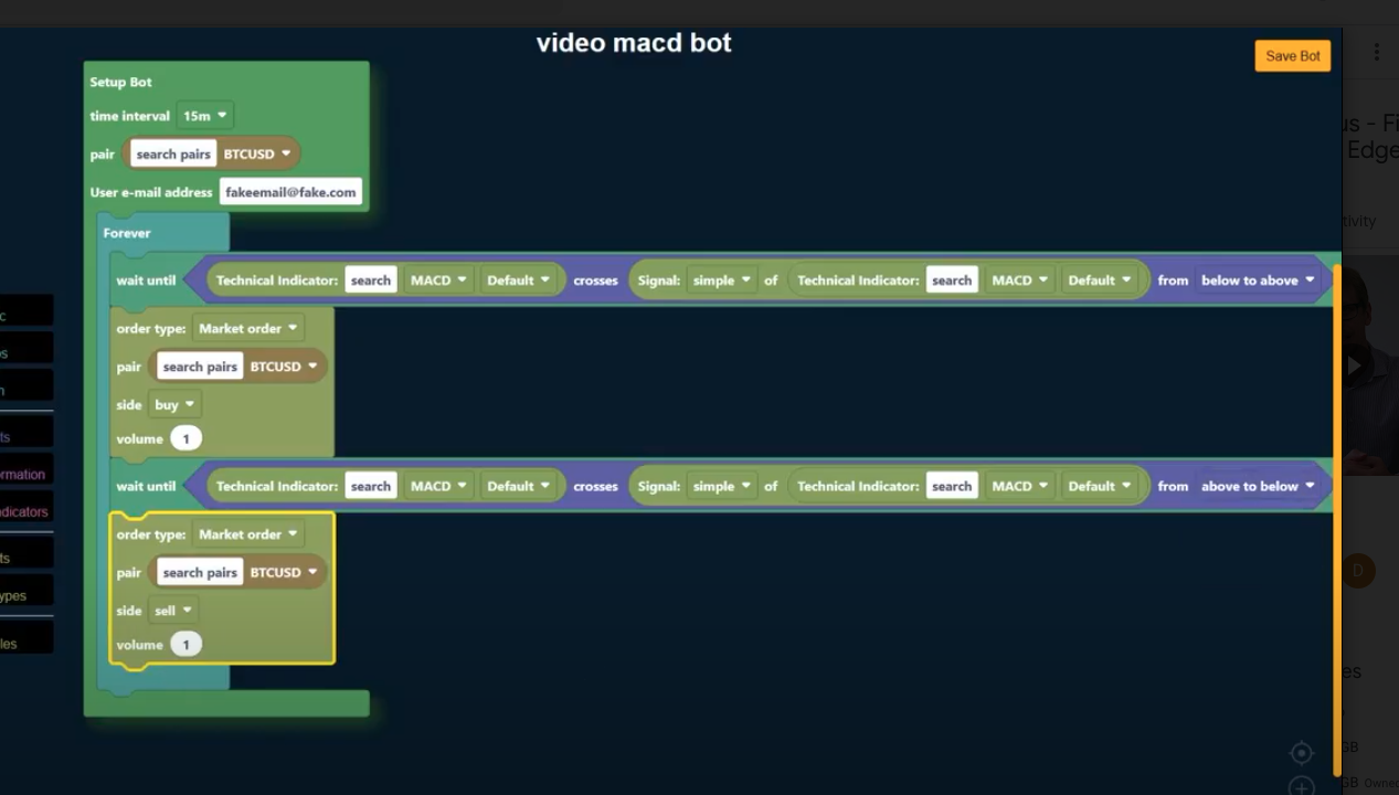
ArcTaurus is a drag and drop no-code software, tailored to automated cryptocurrency trading. The interface consists of jigsaw puzzle-like pieces, which by connecting together, triggers the corresponding code.
There are 4 puzzle shapes,
These 4 shapes represent 4 aspects considered core to programming. Setup holds all the code like a function, logic works as a stop/start point where code is checked against a condition, boolean allows checks for if something is true or not, which then triggers logic, and number allows any value to be stored and referenced such as the price of a coin or an indicators value.
These blocks are stored in categories to the left hand side, split based on similar function.
Each category contained blocks of the same purpose, for example logic blocks (for users to control decisions such as if this happens do that, or if this value is bigger than that value), or market events (which detected changes in the current market price).
Blocks then connect together to establish a logical trading strategy
Original ArcTaurus design prior to my involvement
Research
Discovery
- I assume that technical and non-technical users will need very different support - It was clear this project was unusual in its catering to both demographics, as most similar products handled only one, and thus tailored onboarding to meet the users skill level
- “Needs more human language" – we need to translate code into understandable everyday words for this to work. How do we help establish coding concepts in a way recognised by non-programmers? This presented an opportunity to seek out non-technical users for research
- “Debugging is critical" – We need an un-intimidating but firm interface to explain why things don’t work and make it easy for users to fix them
- “What do the visuals mean?" – Develop a stronger more identifiable meaning and connection between colours and shapes to aid users.
“No code attracts non-technical users who can’t build it themselves, as well as technical users looking to save time. Both need the same services but will use them very differently”
-Summary of initial user interviews with beta testers“Users need onboarding, but they like to assume they don’t”
-Key finding through observational studiesCard Sorting
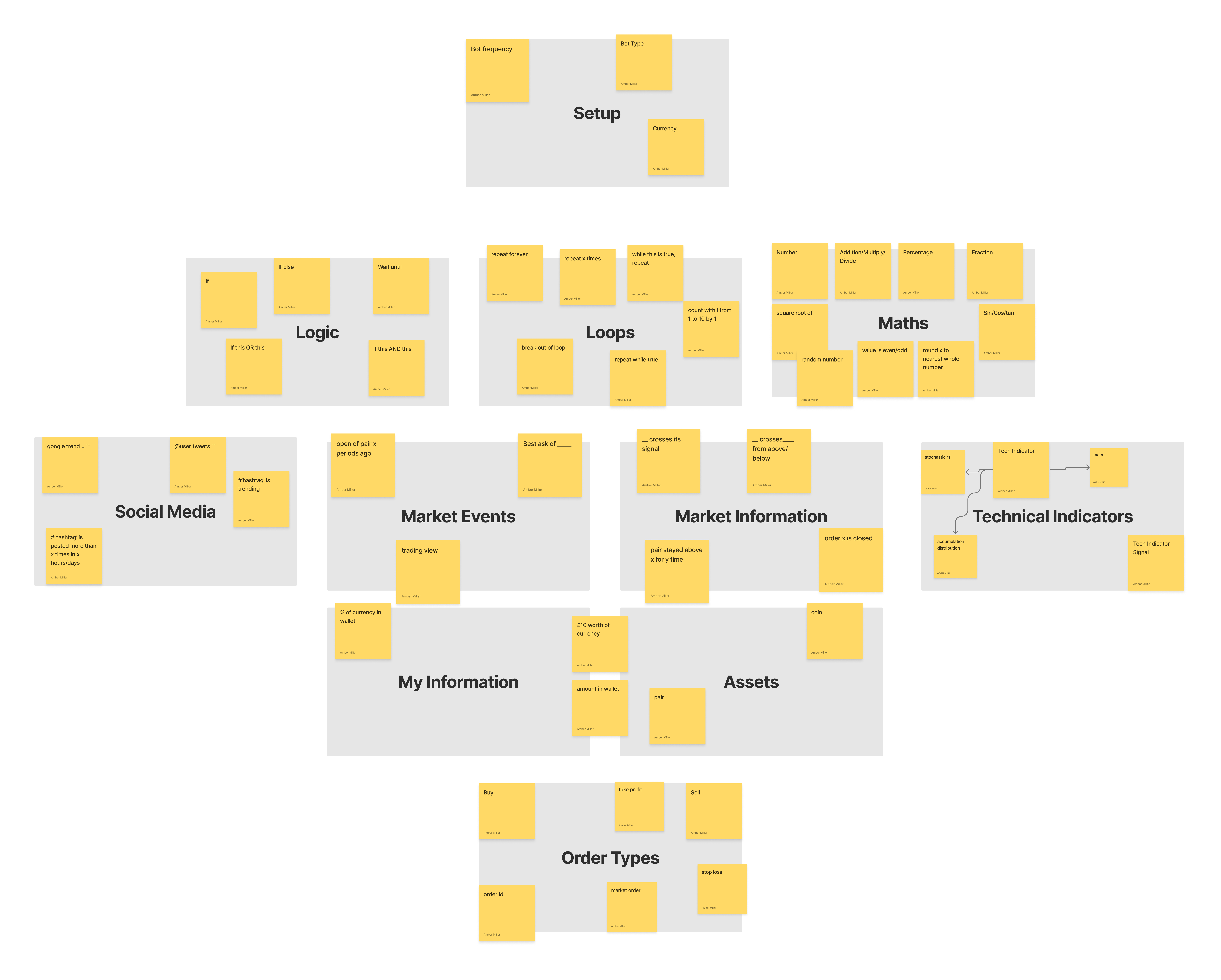
Because of the complex nature of reducing programming terms to blocks, card sorting was used to help link similar terms and build a foundation for categorisation. This was performed both internally with other developers, to ensure the coding aspects were correct, as well as with non-technical users to ensure they could find items during task walkthroughs.UX Design
Redesign of existing UI
The first stage of the UI Overhaul was identifying suitable colours. As the application features 11 different categories of blocks. Due to the companies astronomy themed branding, as well as the popular ‘De-Fi’ UI trend associated with cryptocurrency, a glow effect was added to the product using filters. This helped provide visual interest and add a 3D sense to the blocks, to differentiate from the base ui.
Onboarding - design
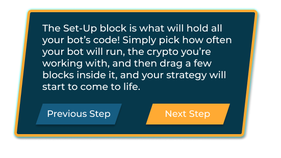
For onboarding a tutorial system was developed. This was split into 3 categories to cover 3 pain points – the first to explain how the Blockly UI, the second to explain the different categories of blocks, and a third to explain programming logic and some getting started ideas. The third section proved the most difficult due to the laws around financial advice, and the age old advice ‘show don’t tell’ was impossible to follow.
Pop Up Ideas for tutorial system
Onboarding - user testing
After re-entering user testing with the proposed onboarding, it became clear the assumption that many users in the target demographics, particularly those already technically proficient, assume they do not need onboarding and that they are able to figure it out through trial and error, which the base system Blockly doesn’t easily lend itself to. This prompted the final version of the onboarding software, internally called ‘Hidden Onboarding’.
"I know there's a tutorial, but I'm sure I don't need it
- Summary of users in onboarding studies, who ignored the tutorial but did in fact need help to figure out the platformOnboarding - problem solving
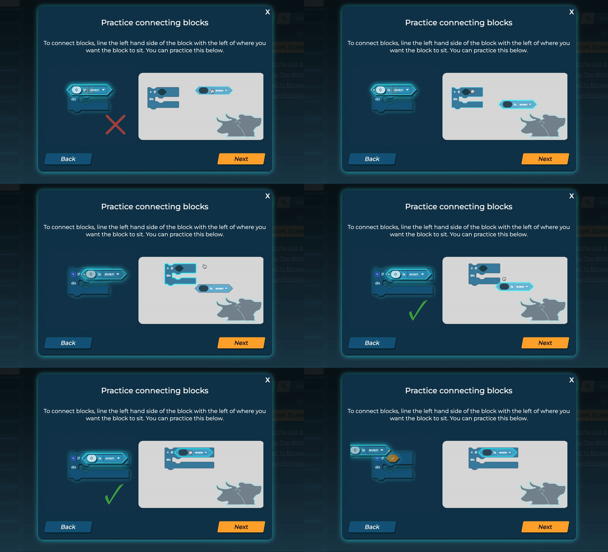
Hidden Onboarding relied on delivering the most critical skills and knowledge for the product in a simple quick way that didn't feel like learning. A smaller version of the blockly window was implemented in a pop up with some simple blocks that users were asked to assemble. This was shown when users local storage indicated it was their first time visiting the platform.
New Feature - Commenting
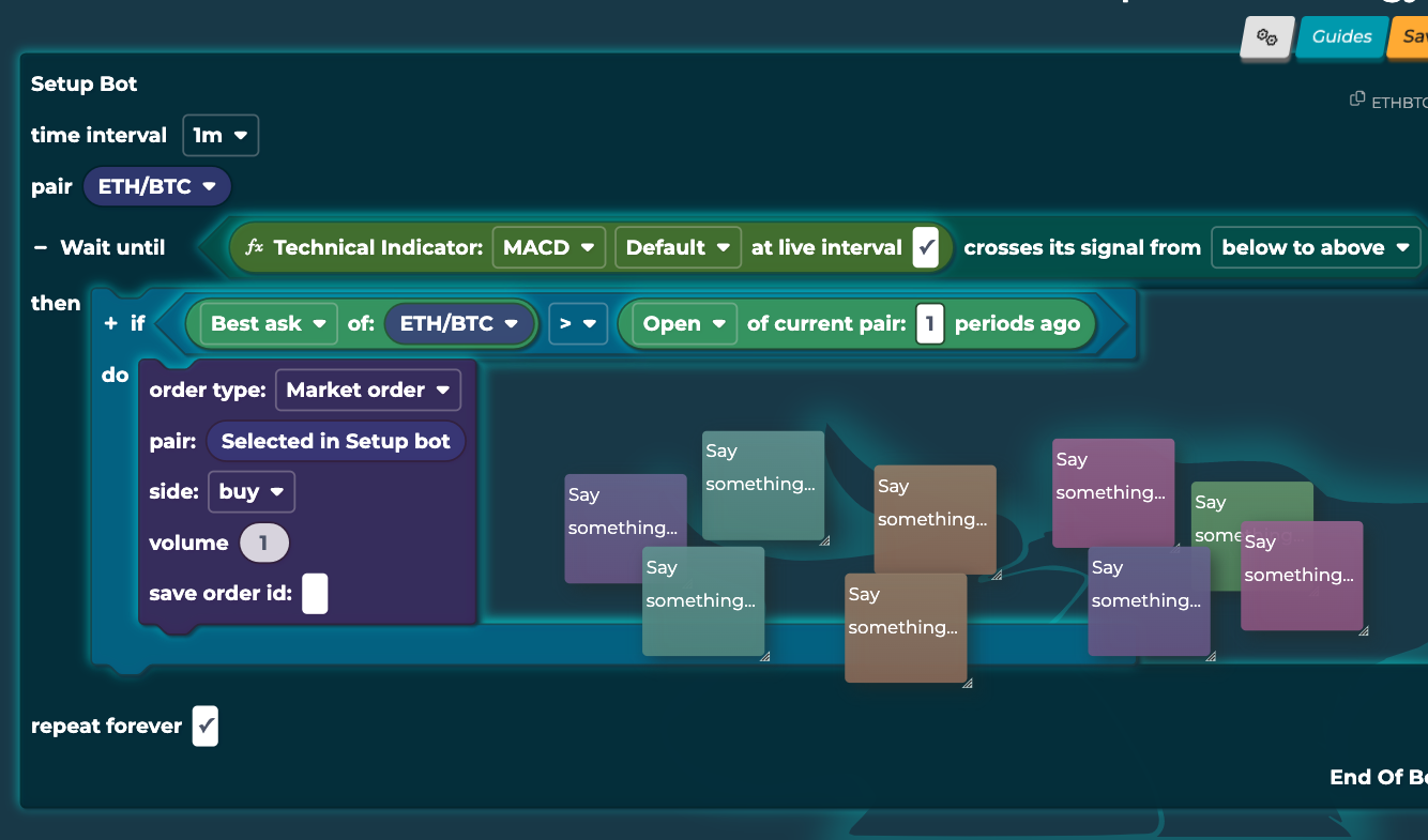
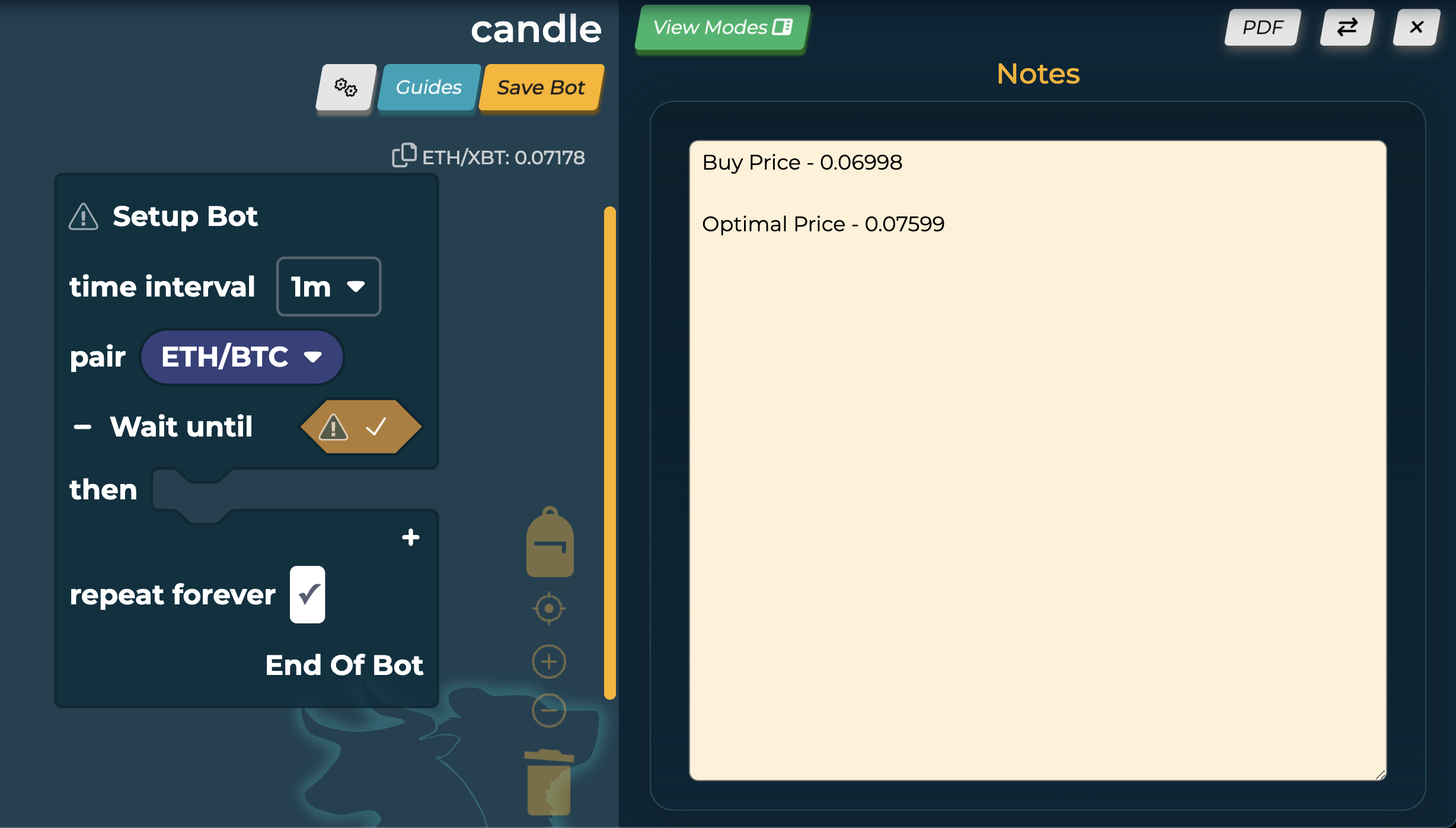
As some technical users missed aspects of real coding, so commenting was added. Programmers add comments to document their work and remember what each part of it does, and this is still useful in no-code applications to remember how you built your system. This was added to ArcTaurus in the form of sticky notes, which could be attached to bots, as sticky notes seemed the correct hybrid for technical and non-technical users, as well as for internal tools for teaching the product. They were also customisable as they could be collapsed, and drew their colours from common IDE colours, to allow colour coding notes.
This design required unearthing the no longer supported Blockly core commenting system, and updating it to be functional and improving the aesthetics. As a result, it may later become part of Blockly as a plugin.
Usability Implementation - Bot Wiki
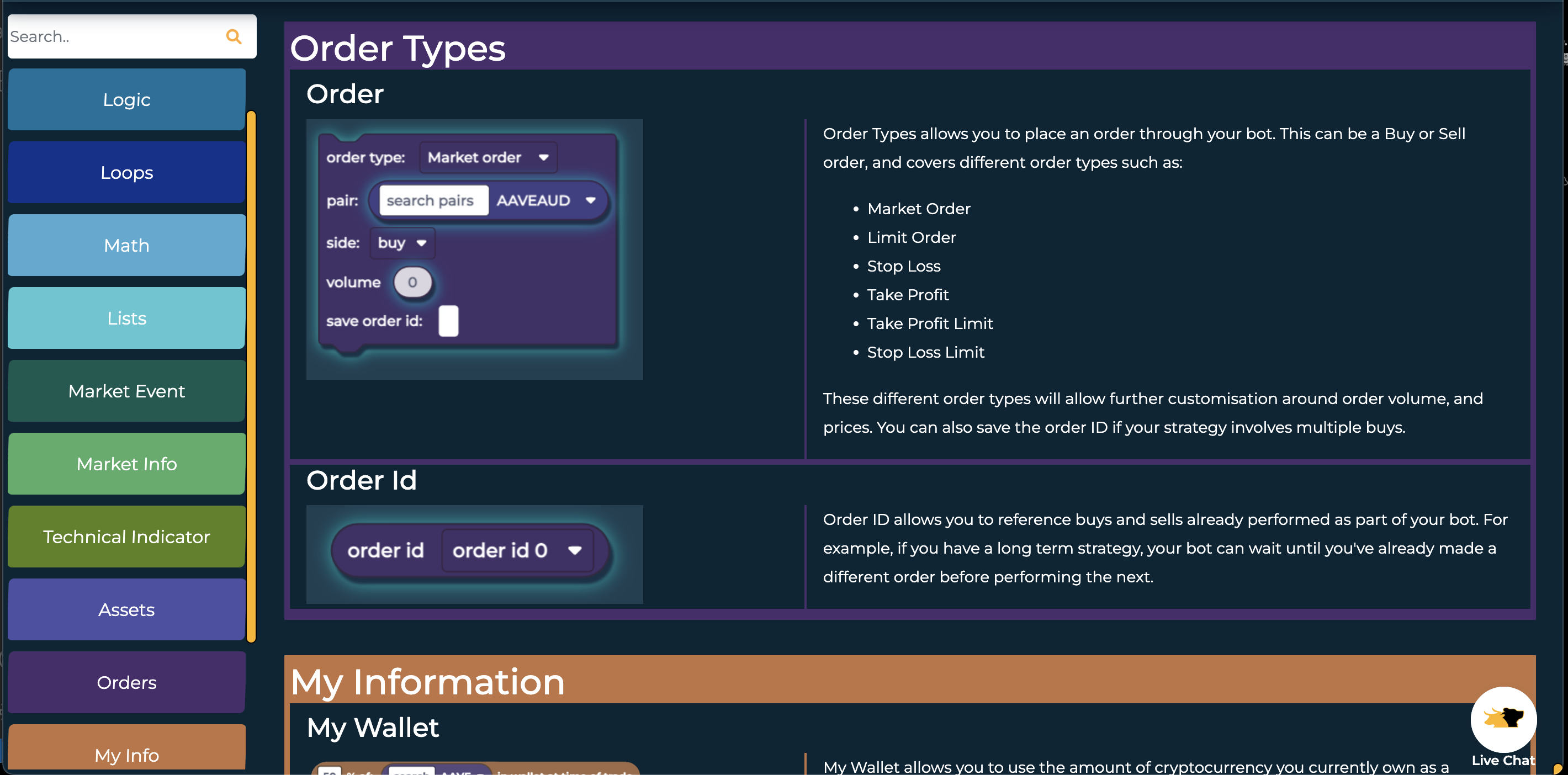
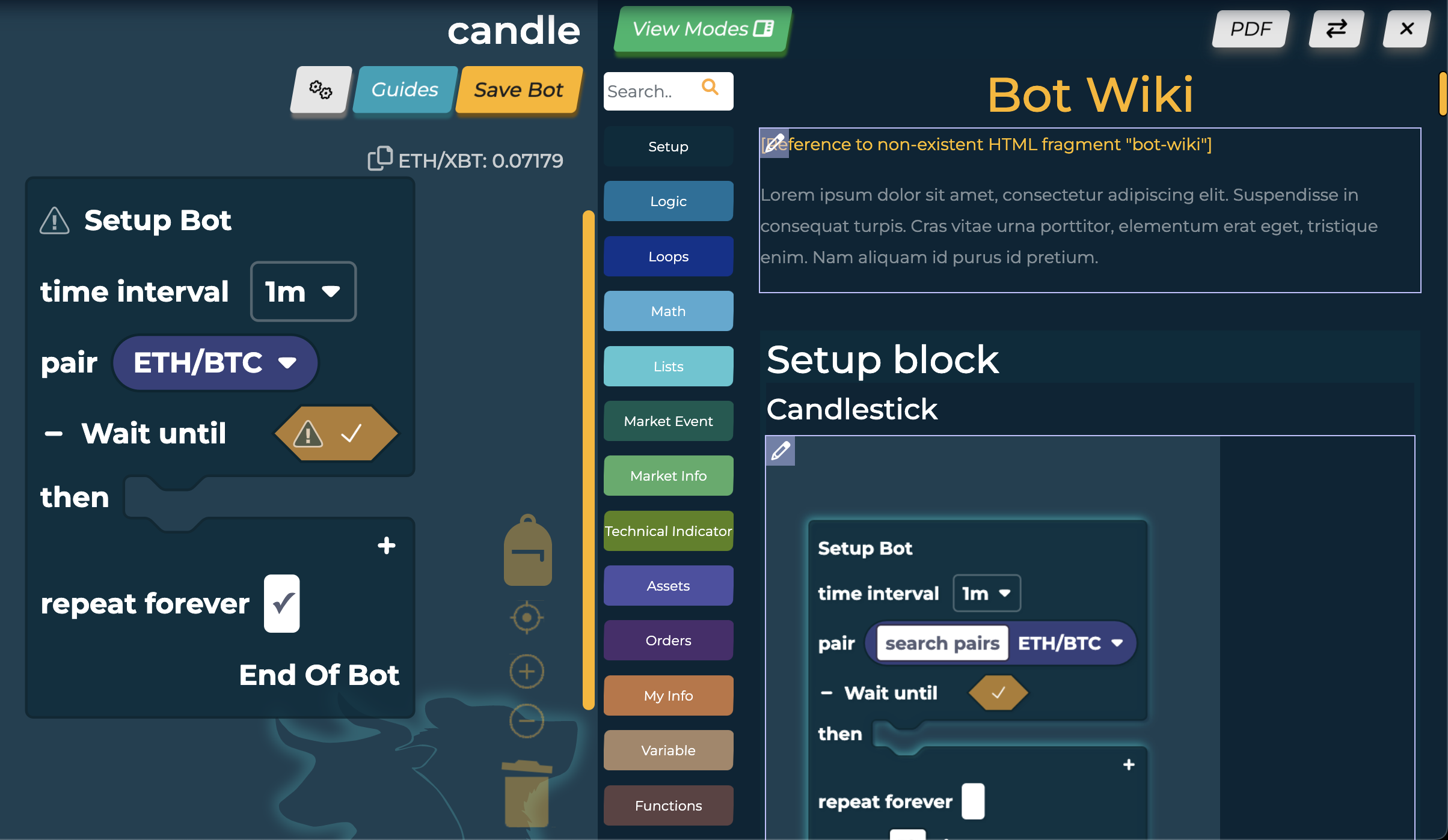
To help users learn and improve their training, I built an accompanying wiki on all the bots and their uses. The copy was written in collaboration with two professional crypto traders to ensure accuracy, but readability. Each block on right click had a 'Help' option which linked to the wiki entry for it.
The ui was designed to emulate the ArcTaurus bot builder with the categories along the side. Each section was also colour coded to match the category to help enforce pattern association.
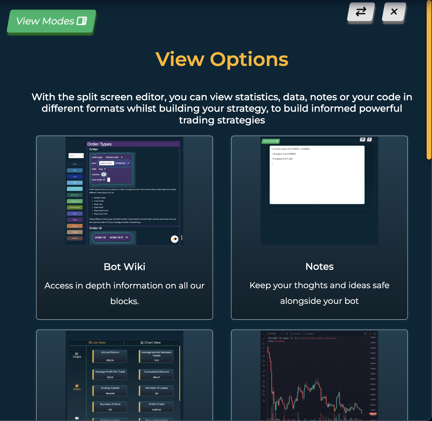
New Feature - B2B Extras
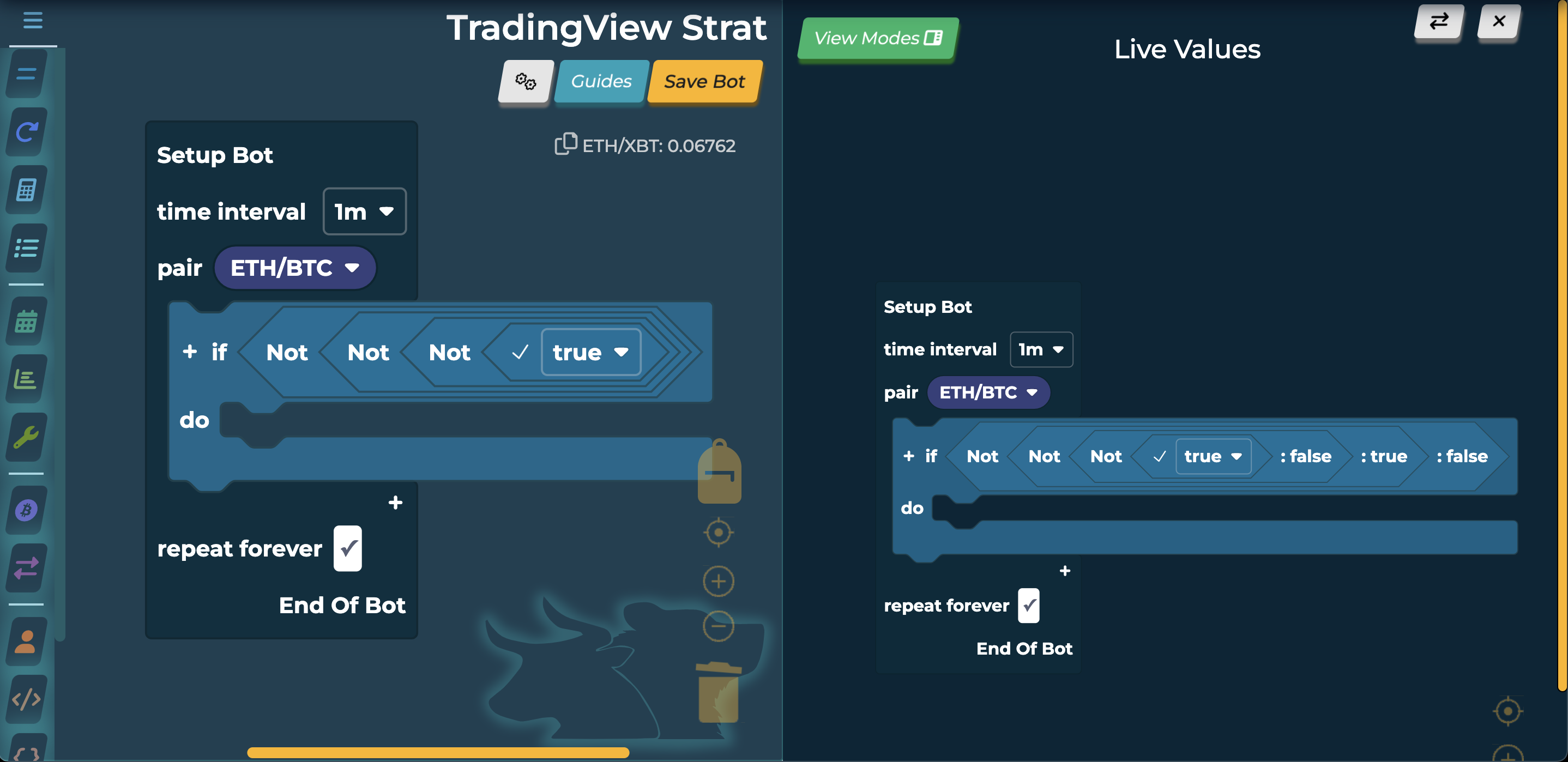
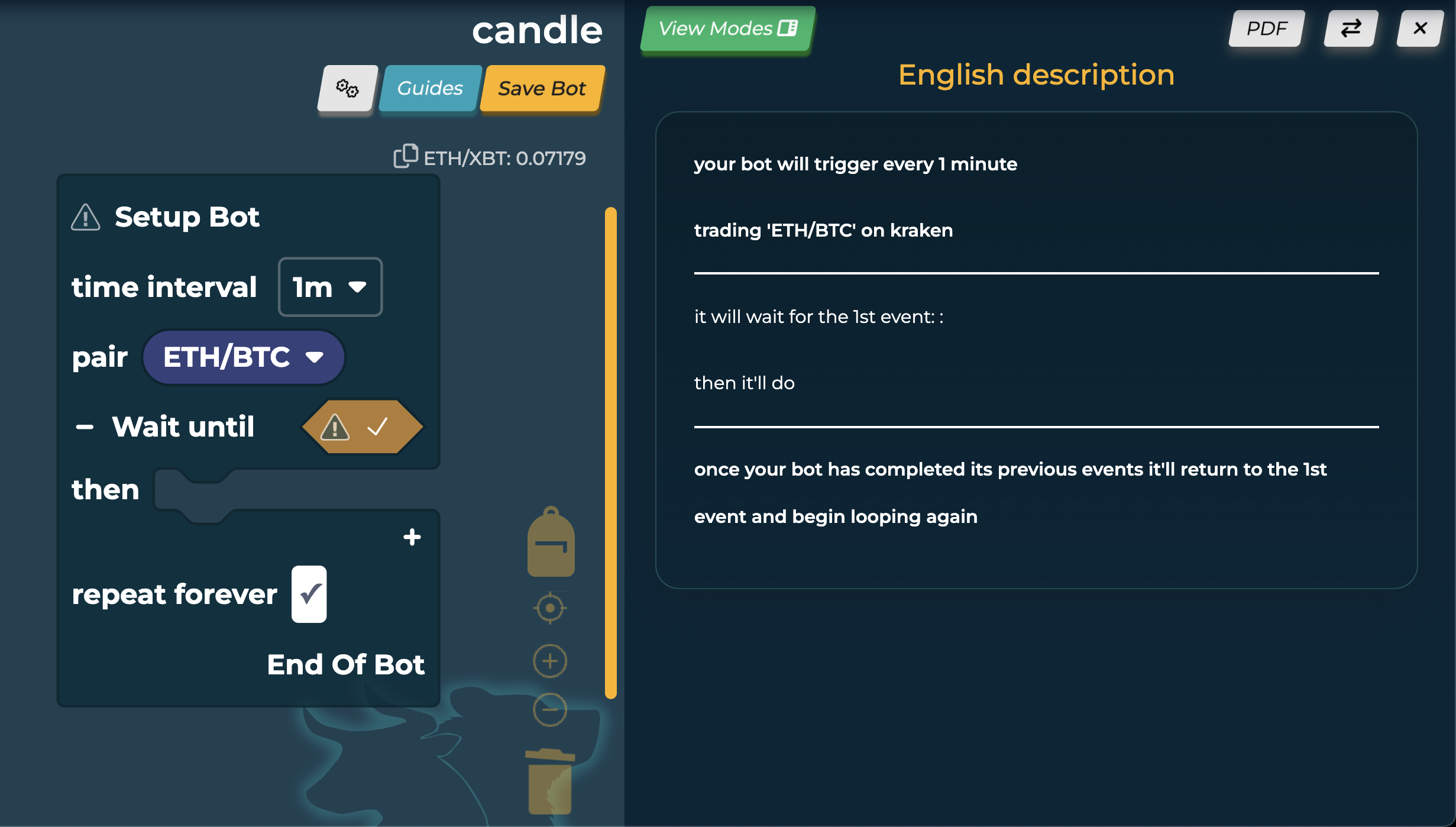
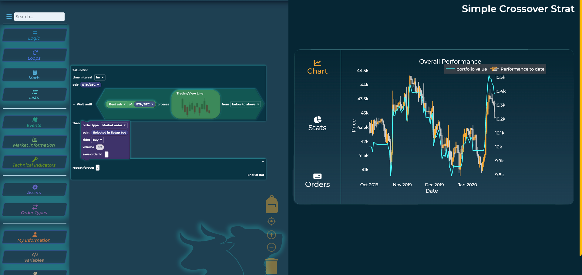
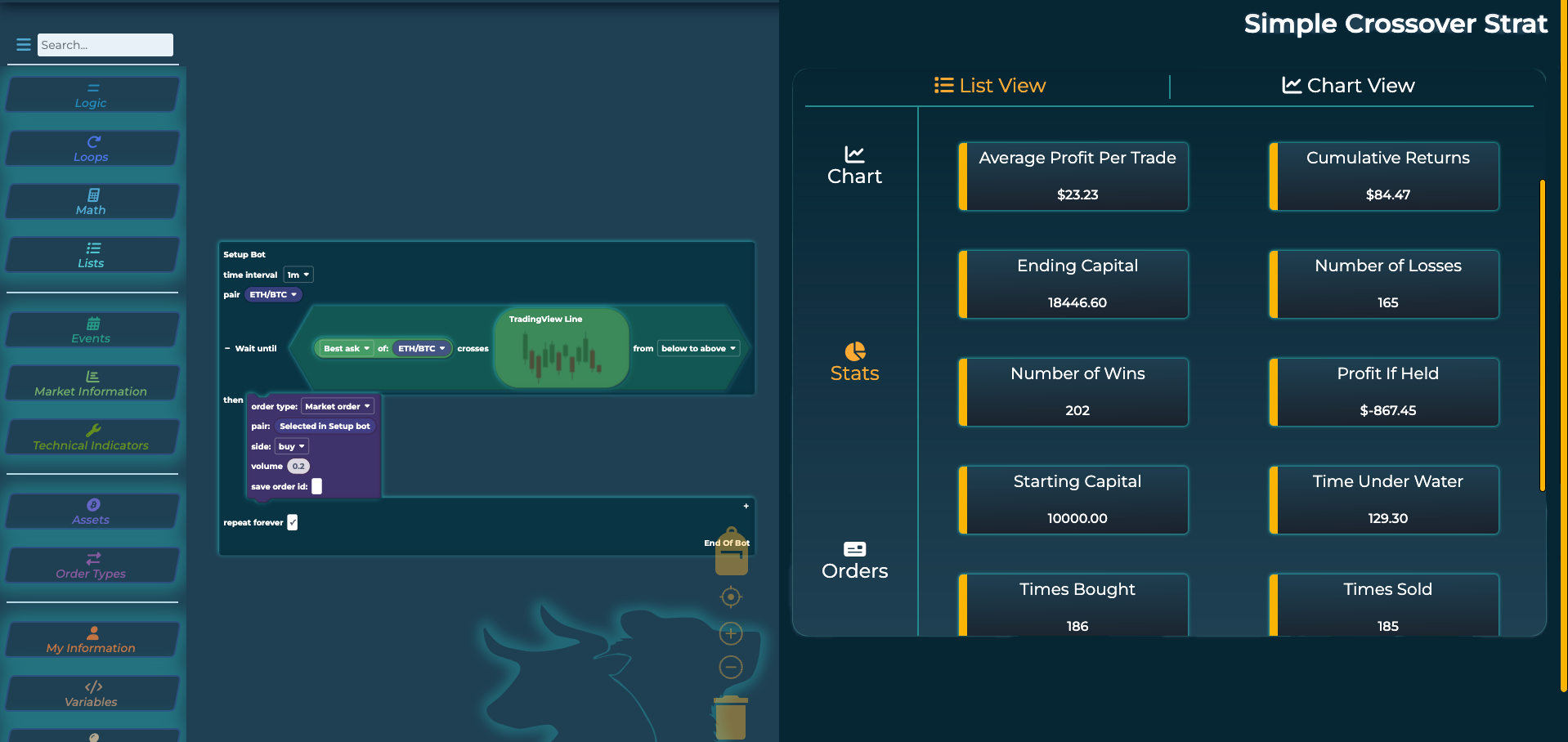
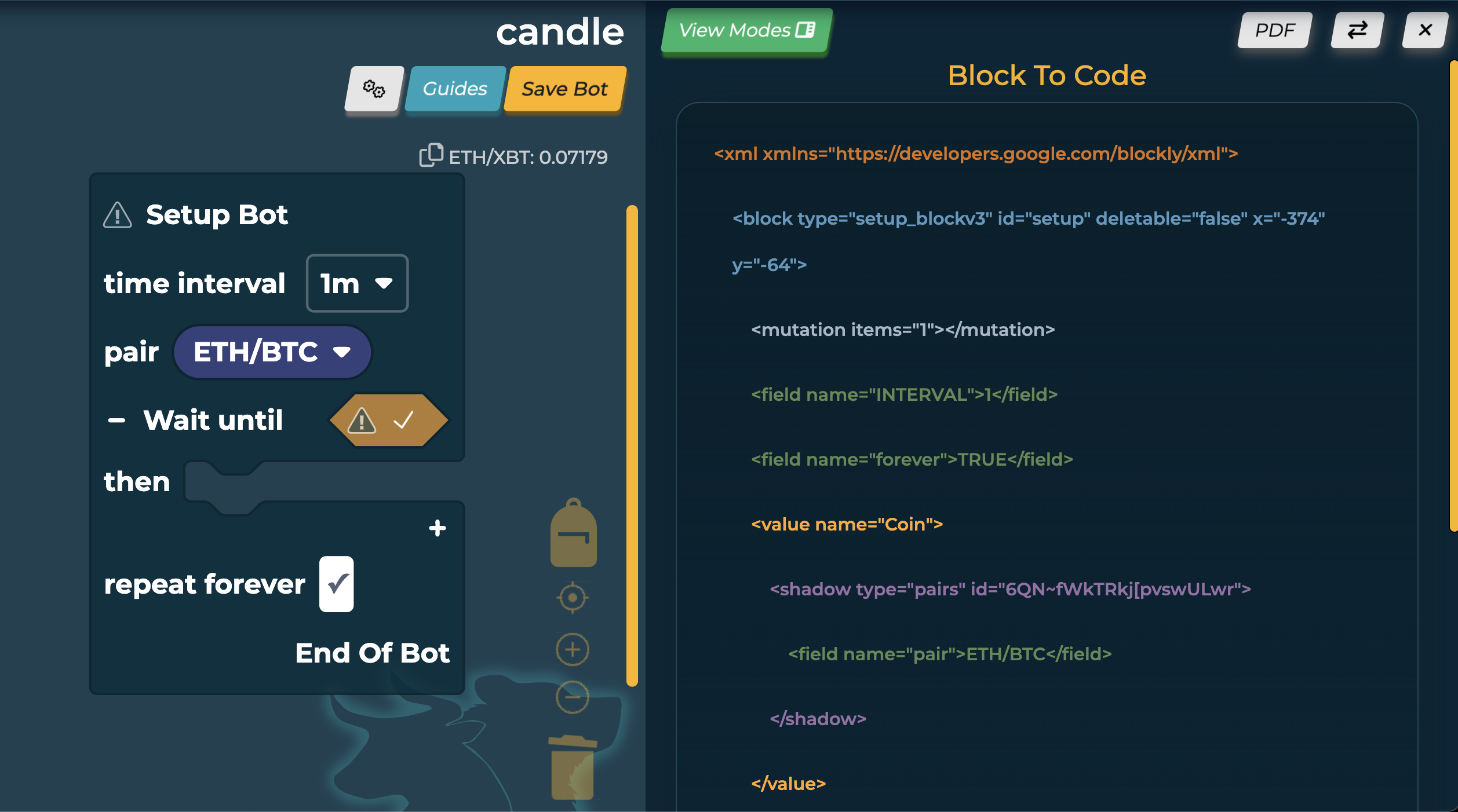
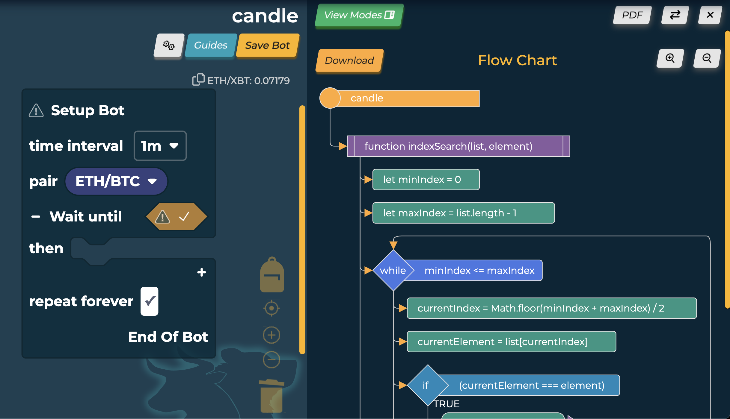
To address the businesses needs, a Business to Business version of the product was also developed aimed at professional traders offering additional information. To solve how to incorporate so much extra information, I developed a new UI ‘Split Screen’. This offered clients additional services such as reading the code generated in alternative formats including one designed to mimic English, as well as outputting the blocks into a flowchart, connecting to a testing (dashboard) system, and exporting all data into a pdf.
This presented an opportunity to address the pain point of needing more human centric language by outputting the blocks to several different methods in the hope people find the best way to read it.
New Feature - Error Handling
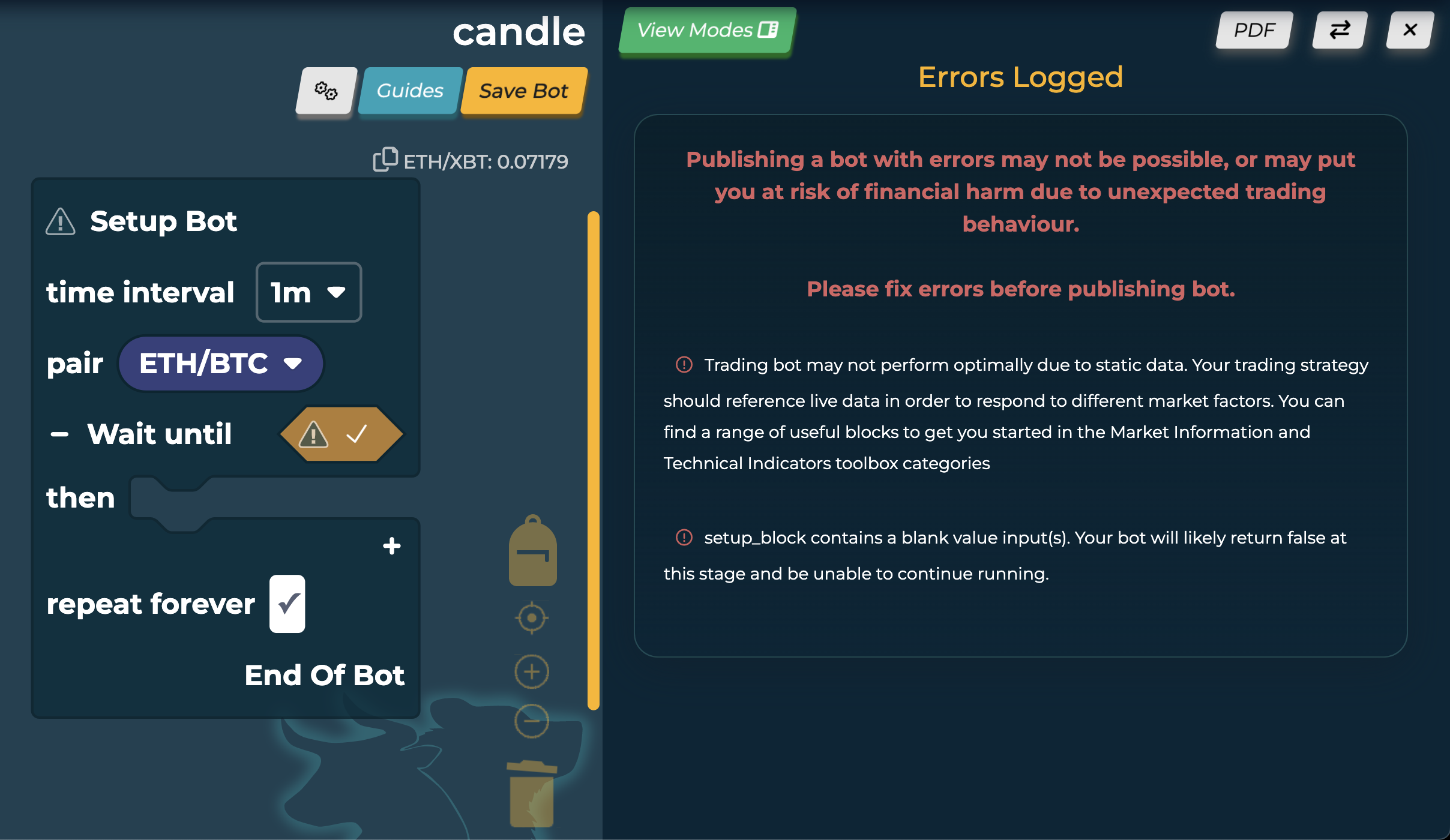
The new Error system adds a clickable warning icon to any blocks that contain missing inputs. It also adds warning to the setup block if the bot contains improper logic. Clicking the icons, or saving an errored bot, display the error page in split screen. Each error is listed like a console, featuring a clickable bullet point to highlight the problem visually in the code.
The addition of the Split Screen UI, particularly it’s Error handling system, saw a remarkable improvement in bot building time in novice and non-technical users. Based on user interviews, key findings where it ‘Improved trust in the bot’ by validating there were no logical errors, and ‘Helped discovering new strategies and ways to build’ by allowing more trial and experimentation when building.
Errors if the user turns off visual debugging
Improvement - Recommender System
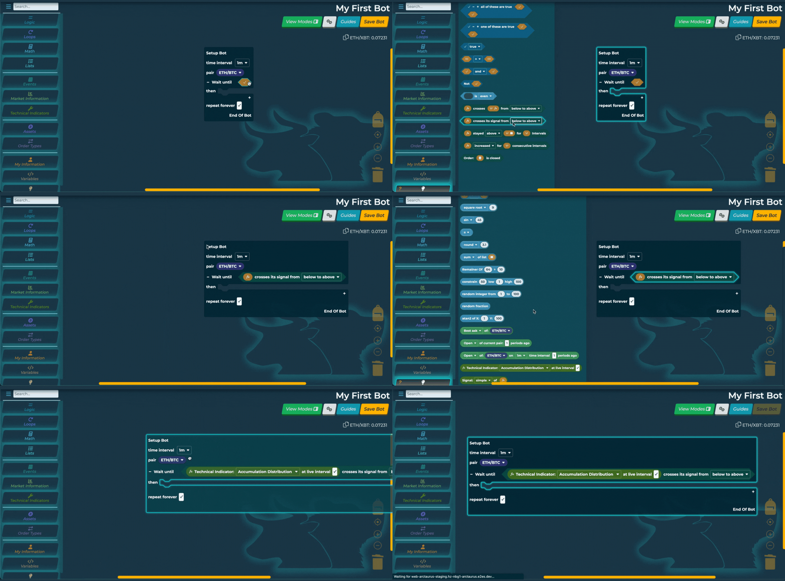
To make building bots easier and quicker, as well as improve discovery time for blocks, there was a recommendation system in place that when clicking on an input, it opened a list of all available blocks. I pushed this system further, by redesigning the icons to be more recognisable, and writing code to automatically place the block selected from this list into the input. This drastically reduced bot building time, as well as overcoming the accessibility hurdle of the difficult click and drag motion. It also inspired users more confidence to try different blocks, as they could intuitively see where they connect.
Final Design
I created this video for some promotional work the company was undertaking
Insights
- Time til Value reduced by 92% (approx 25minutes to 2minutes)
- Reduced average bot build time from 15minutes to 1 minute
- Designs presented alongside talk at the Blockly Developer Summit as an example for accessibility in no-code
- Improved confidence and promoted upskilling amongst users through non-invasive education tools
What I learned
This project taught me to trust my intuition as a designer and UX professional. For example, in discovery, the element I deemed most important to the project's success was error handling. I planned to use this as an accompaniment to onboarding to encourage self-correction and allow users to learn from mistakes rather than risk failure and exit the software. However, this feature fell down the priority list due to the business assumption onboarding was vital in reducing user errors occurring at all. Once the error handling was added, it addressed an array of pain points in a simple yet effective implementation.
It also challenged me, allowing me to work with a very different user base from most projects. Due to the culture surrounding crypto, I had to work hard to hold my own as a female designer in user interviews and team meetings and advocate for my own areas of expertise. This has made me a more resilient designer and worker.
I believe this project would have been more successful with a larger team and the accompaniment of a senior front-end developer to help alleviate my workload; however, I remain proud of what I built under the circumstances.


