Jump To
Project overview
Discovery
Design
Results
Simplifying our customer portal
How do you migrate legacy un-advised customers onto an adviser-led platform without making them feel excluded, confused, or unsupported?
No time to read the full case study?
My Role
Senior UX Designer
UX Researcher
Team
Product Owner
Business + Change Analysts
8 Full Stack Developers + testers
Other stakeholders: Risk, Legal, Compliance
Timeline
3 Month Programme (originally sized at 10months, but paused due to restructuring).
Impact
Simplification of
3 complex financial services journeys
Drastic improvement in feedback about user's
sense of belonging
Context and constraints
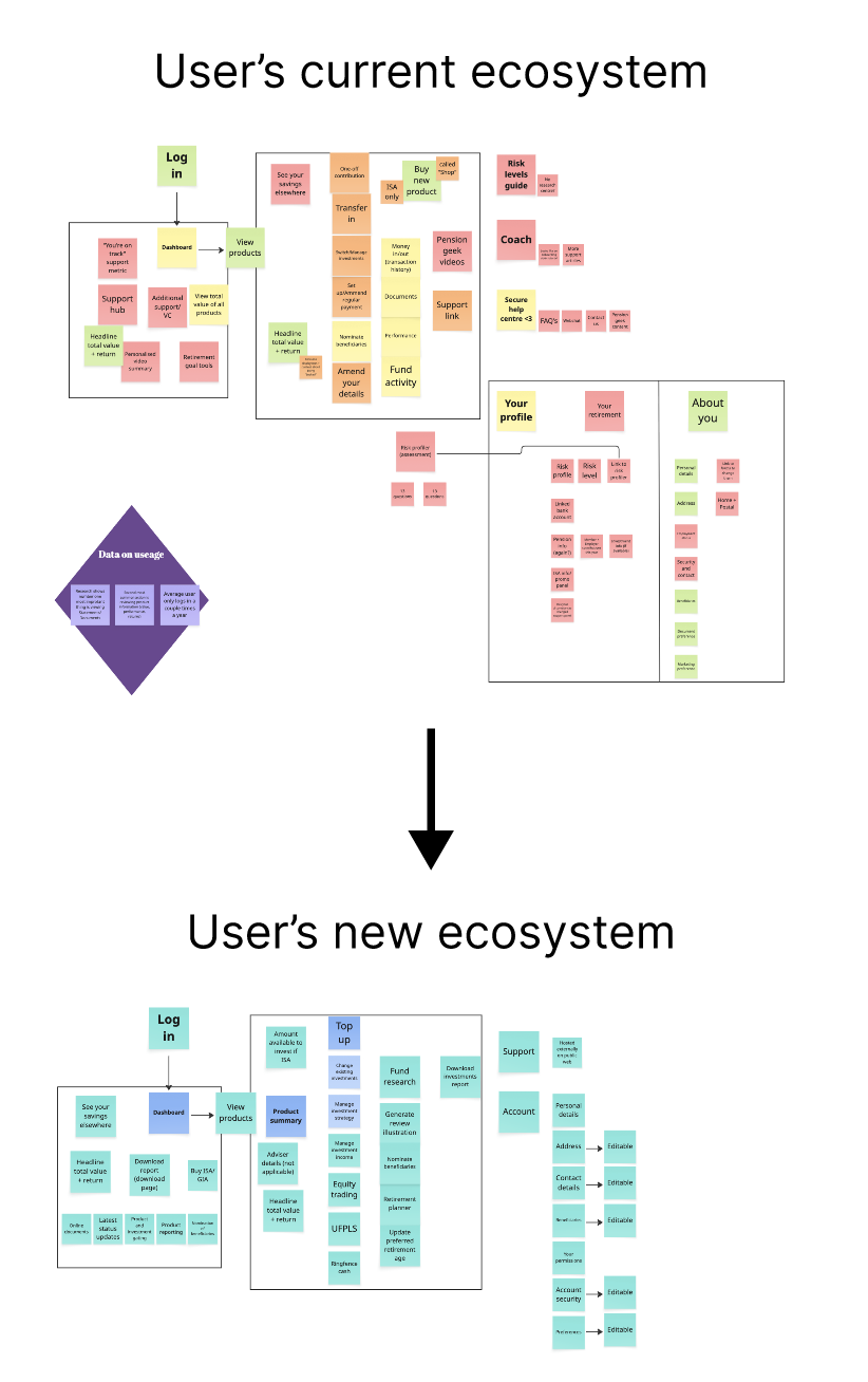
As a large financial services company, we had multiple different propositions to support different revenue streams and acquisitions. One of our legacy platforms was a direct-to-customer platform where customers either signed up independently or were signed up via their employer, and could manage their pension and other investments via a single portal. This platform was incredibly simplistic with restrictive fund choices.
On the other hand, our newest platform was an adviser-driven platform where financial advisers could invite their customers to view managed products.
Our old platform was built on legacy software and had notorious maintenance issues for years. It was determined the most economical move was to migrate the user base onto the new, adviser-led platform.
From the start, it was clear that the needs and wants of customers investing via a financial adviser versus those investing through a workplace or individually were drastically different. The project became about striking a balance that kept all users - including advisers - happy.
Discovery
Where to begin?
With so many moving parts and considerations, I needed to develop a clear design strategy for how to tackle this migration
I had to measure things not only by the value of the experience enhancement for users, but also the internal impact and buy ins necessary to support there delivery.
Early insights
Research inputs
To understand the migration challenge quickly, I partnered with a UX researcher to gather behavioural, attitudinal, and analytics evidence.
- 6 usability studies benchmarking current journeys
- 8 interviews with current users
- 2 comprehension studies on language barriers
- 1 accessibility-focused usability study
- 1 card sort for information architecture
- 4 analytics dashboards
- 2 internal service and complaints reviews
What this revealed
Users felt excluded
The adviser-led platform felt intimidating and not designed for direct customers.
Content assumed too much knowledge
Jargon-heavy language reduced confidence and increased hesitation at key moments.
Emotional fit mattered
Even in pensions, customers valued reassurance, clarity, and signs the product was meant for them.
Building empathy in the team
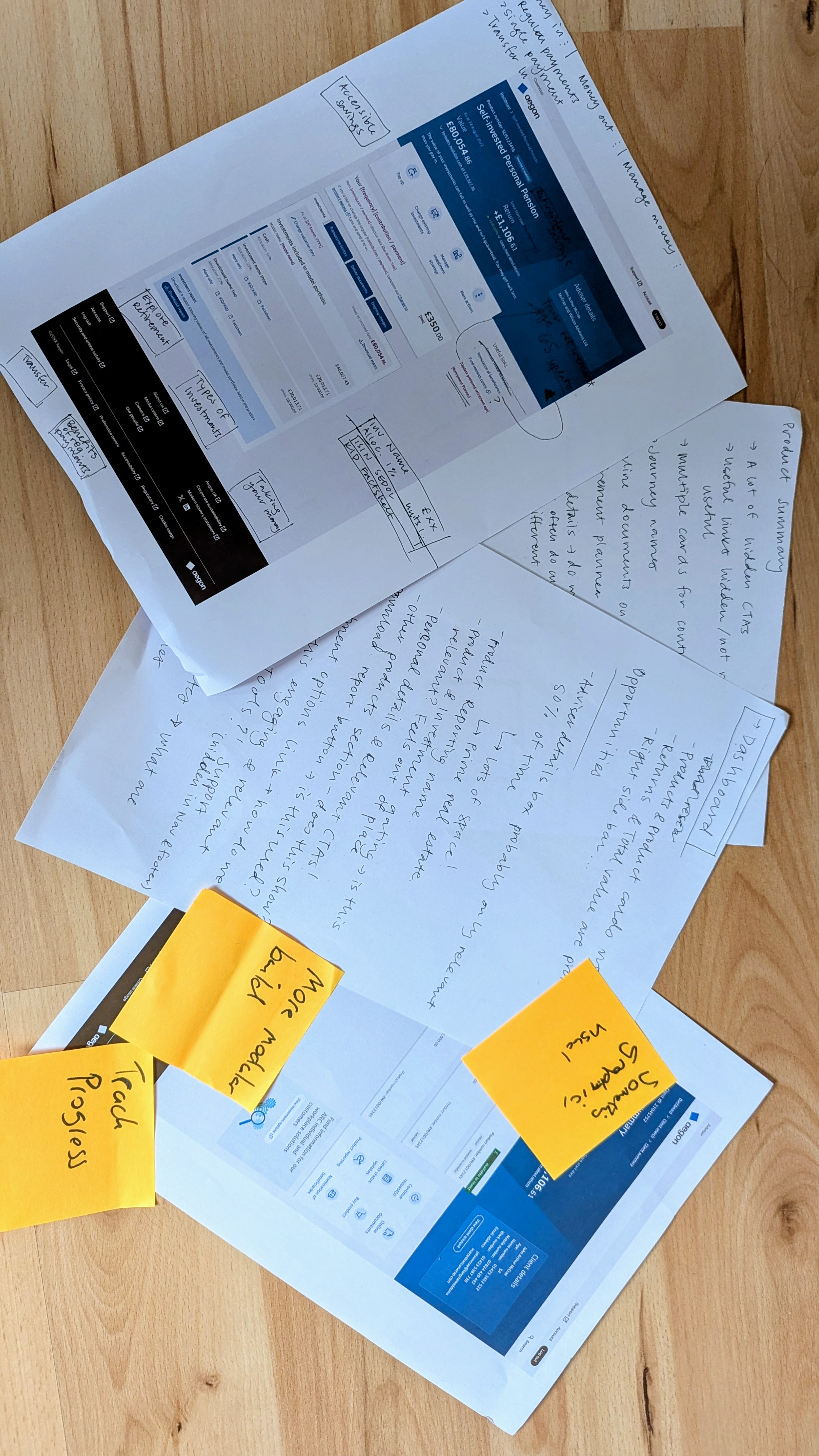
"I feel like this isn't designed for me. I feel like this is saying this is for serious investors and you don't belong here. It makes me just want to get in, do what I need to do, and get out as fast as possible"
- A power user of the old platform seeing the As Is of the new platform for the first time
User feedback like this, while alarming, was instrumental in getting stakeholder buy in for additional changes. Talking to user's allowed us to illuminate to the business the scale of the issue we were tackling, and the pace that would be necessary to deliver it all.
Navigating the landscape of user expectations
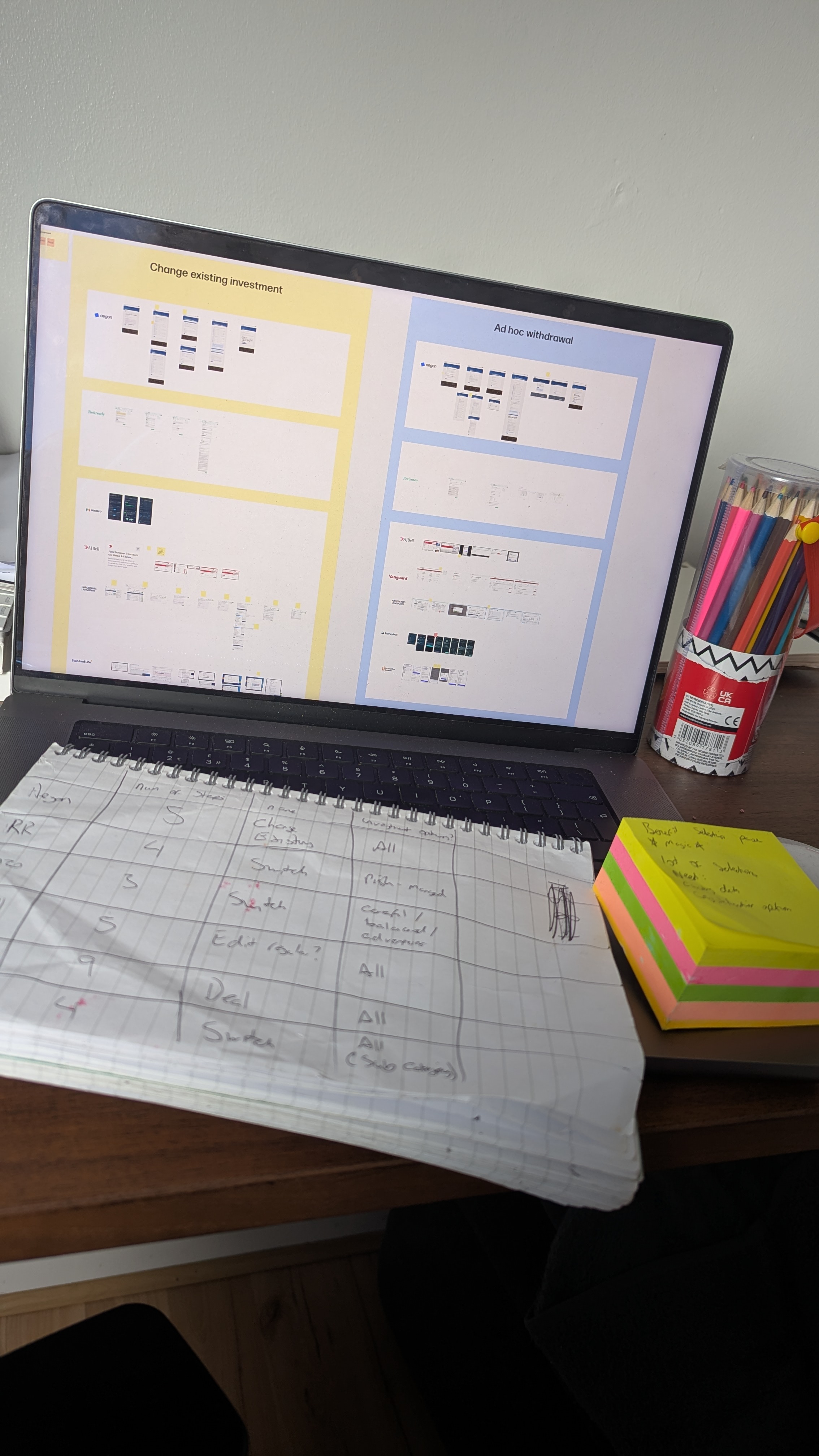
It wasn't going to be enough to take our existing journey's and retrofit changes, it was really important as a designer to get a fresh perspective and assess the competitor landscape.
Jakob's law states our users spend most of there time online on other websites.
By mapping out what experiences they may have on other platforms, I was able to make a much stronger case to our legal team around requirement changes, for example - Why are we the only provider who need to know the source of wealth for a £1 payment?
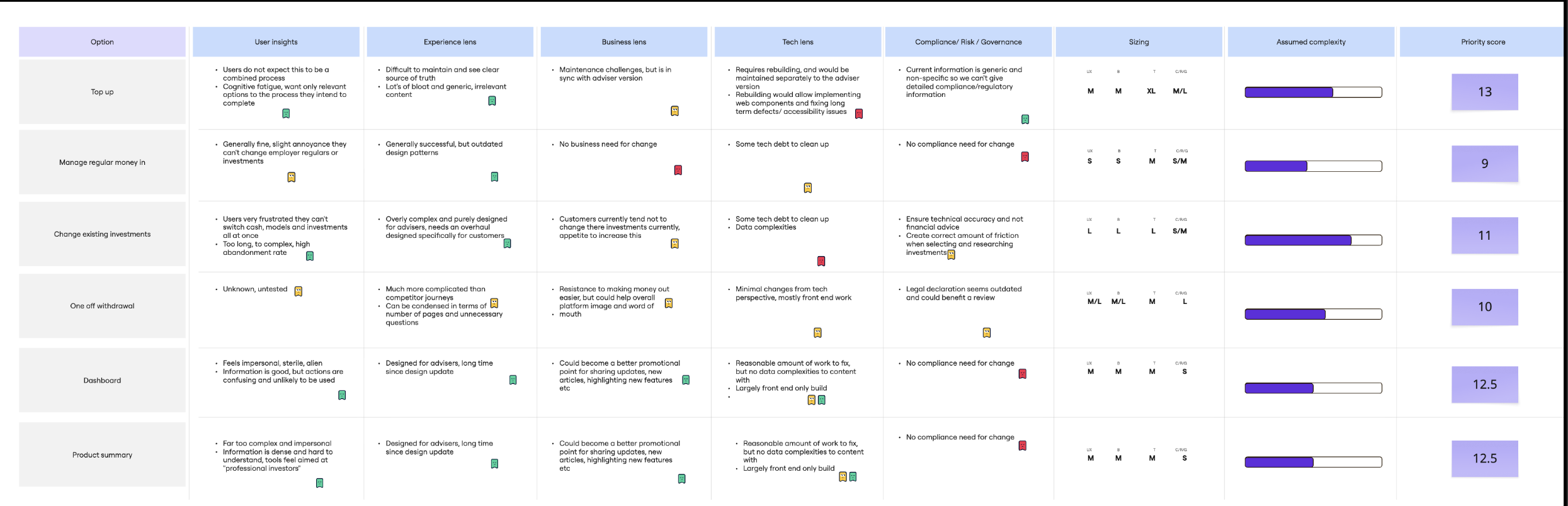
Design KPI's
Reduce user steps by at least 20%
Shrink journey's by at least 2 pages
Earn a comprehension score on a single payment journey of at least 80%
(80% is our threshold for the "easy to understand" category)
Design process
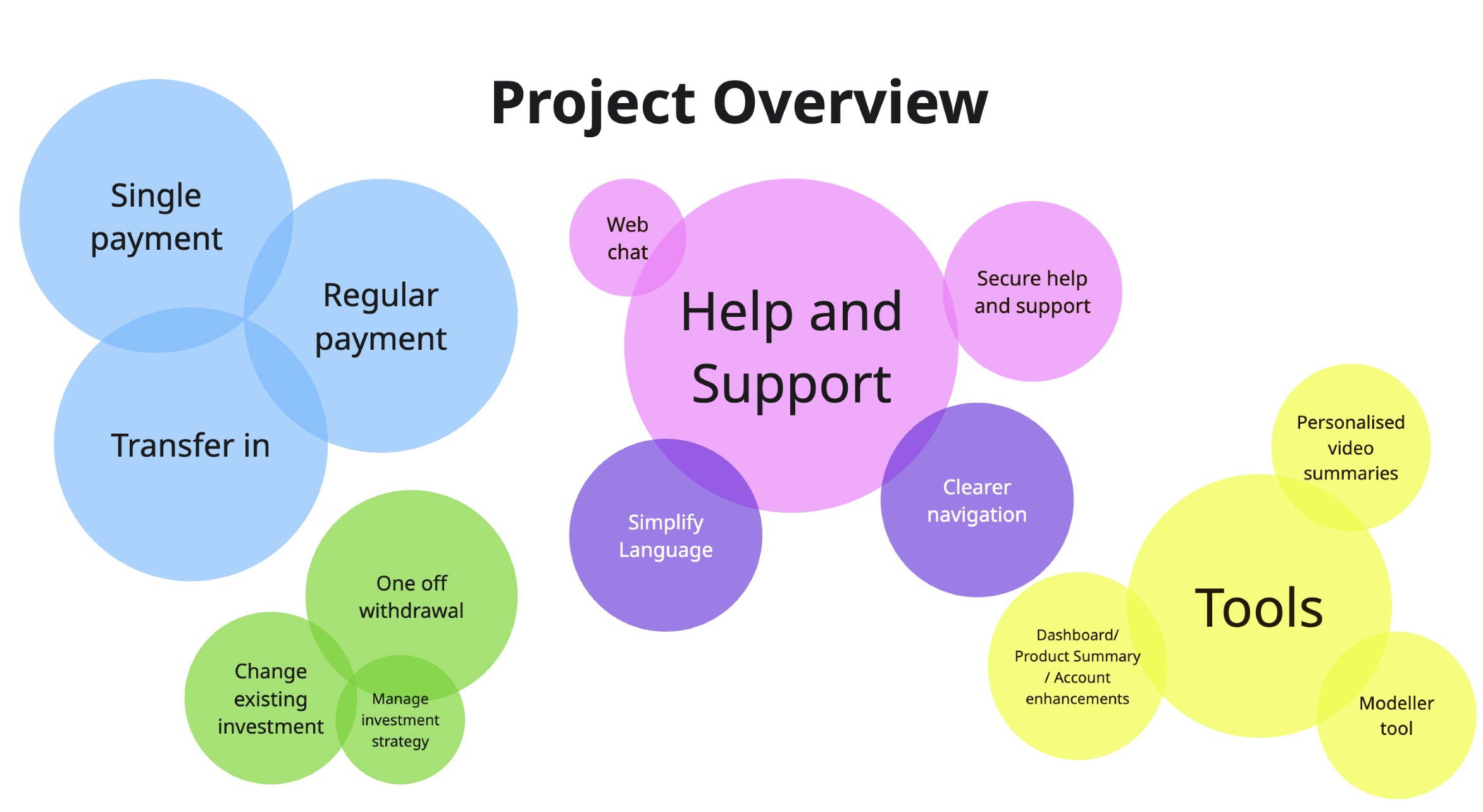
Money in journeys
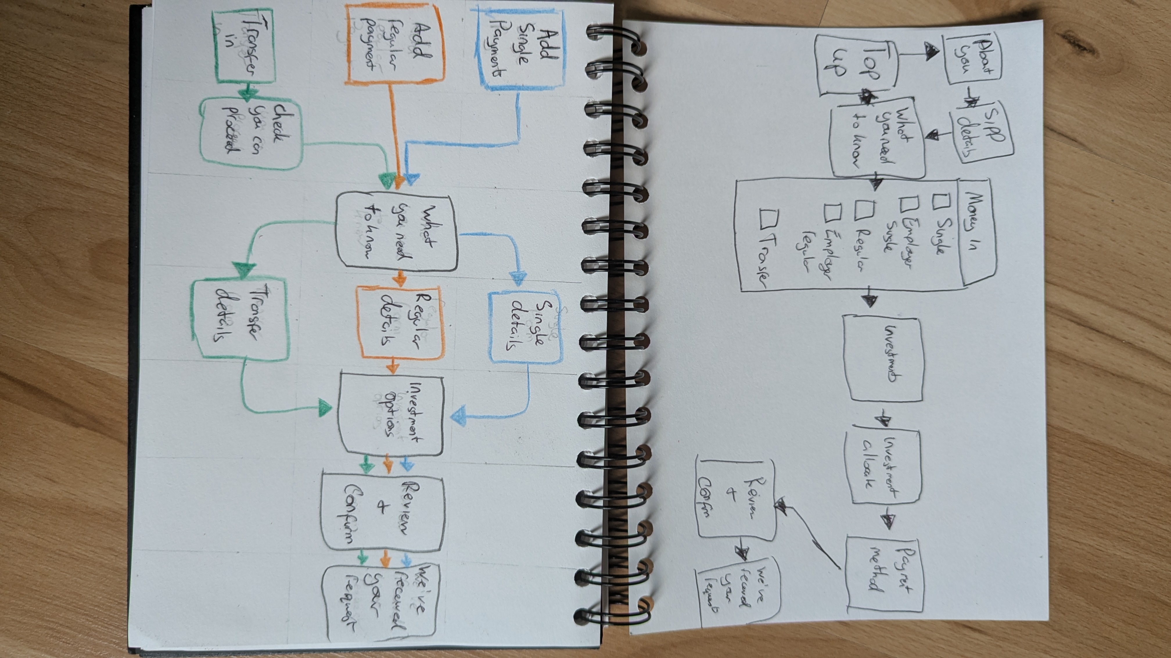
The number one starting point was addressing the expectation mismatch in the steps to add money to a product.
Our current experience was a combined "Top Up" process, allowing users to set up one time, recurring, or transfers all in one journey. This worked great for advisers as they're often doing multiple payment types at once, but for customers less than 1% were doing multiple processes at once . The natural next move was to split the one journey into 3 separate journeys, one per user intention .
Building three new journeys while the clear best case for the user, presented significant maintenance challenges and technical resistance, especially as the team couldn't rely solely on web components. Negotiations with the technology team were key for finding a solution.
Eventually we struck a balance that suited our technical needs, timeframe, budget and, most importantly, the users. I designed and built the experience as one journey, as so many assets were shared, but linked it in a way that users would always perceive it as three separate journeys.
This took the technical benefits of our original journey and married them with the users' needs, resulting in a seamless experience shift.
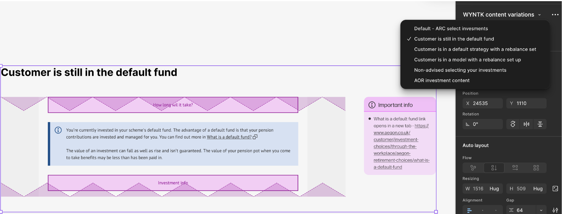
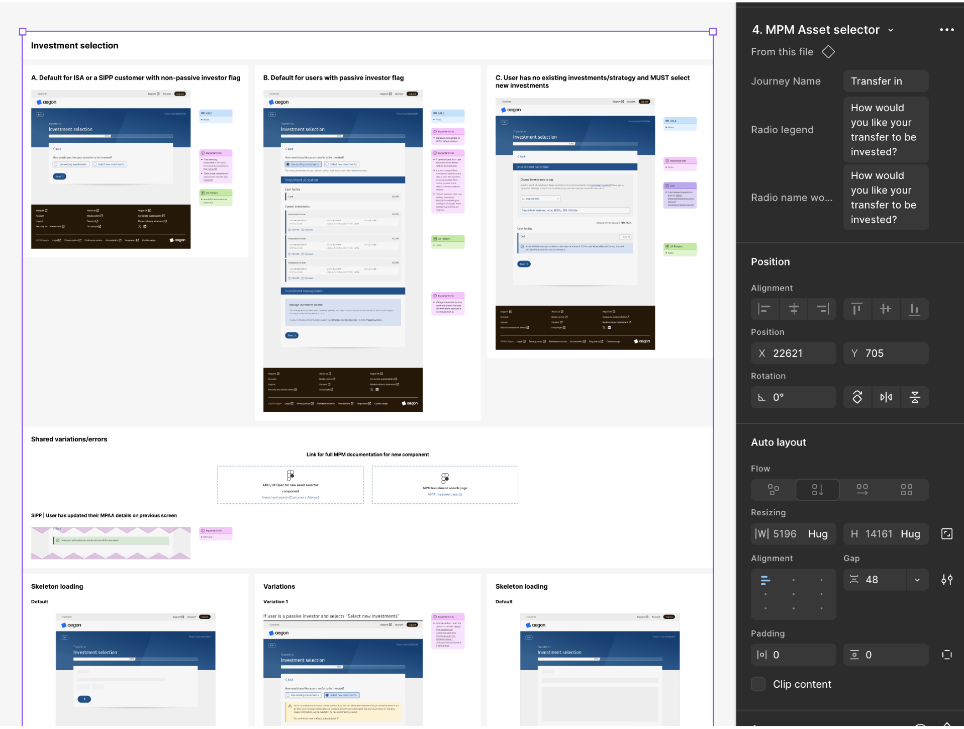
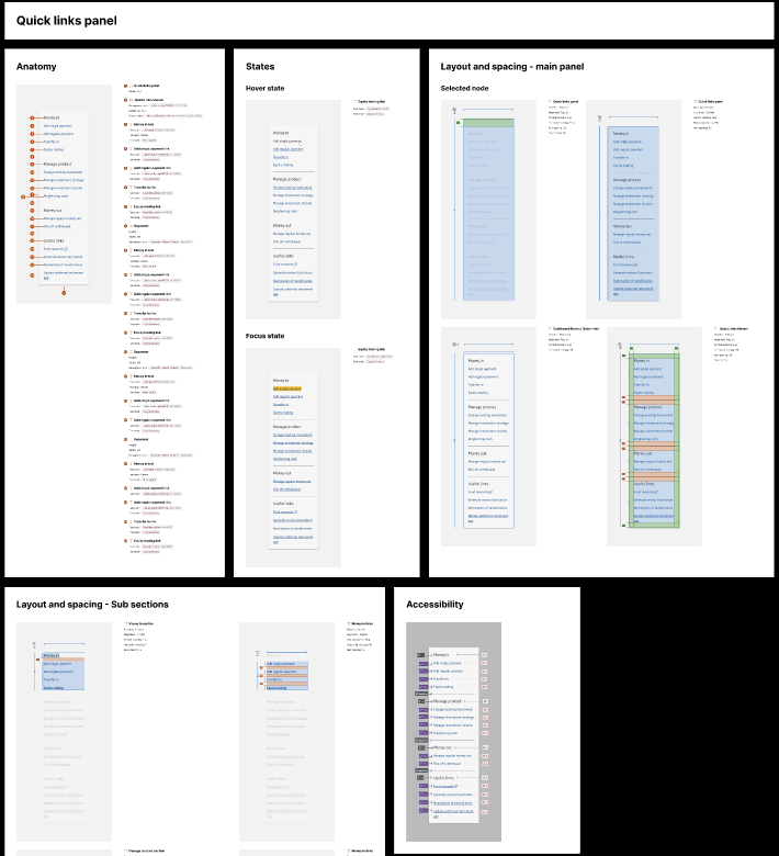
Reusable components
With so much similarity and shared assets between the journey's, it was important to me to set up the project to be as easy to maintain as possible
A key enhancement which the UX team hadn't previously trialled was creating components of full design patterns, including documentation.
This meant I could make an edit once, and have it automatically apply to 3 separate journeys. This made final refinement much easier as typo amendments or new requirements were much quicker to rectify, and documentation could become more detailed as it only required writing once.
Simplified content
One of the big learnings from user testing was that there's too much jargon in our current journeys, and users didn't feel confident risking making a decision, so users would abandon the process rather than guess wrong .
I cut out as many unnecessary technical questions and unnecessary disclaimers as possible, but some remained and required simplifying.
Indexation proved a particularly difficult point; in lay terms it means increasing a payment each year to align with inflation/the Retail Price Index, but the concept was completely new to our users. By making the question more wordy and explaining and highlighting an example of how it works, I was able to bypass one of our toughest dropout points.
.png)
.png)
Fighting Legal-ese
As a regulated industry, it's natural that there are lots of technical terms and required fields to contend with. I found compromises to simplify questions legally required, making them less intimidating to our users.
My changes were a success in balancing regulations and user needs, our updated comprehension scores averaged 84%
.png)
.png)
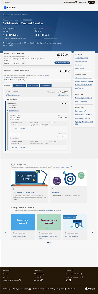
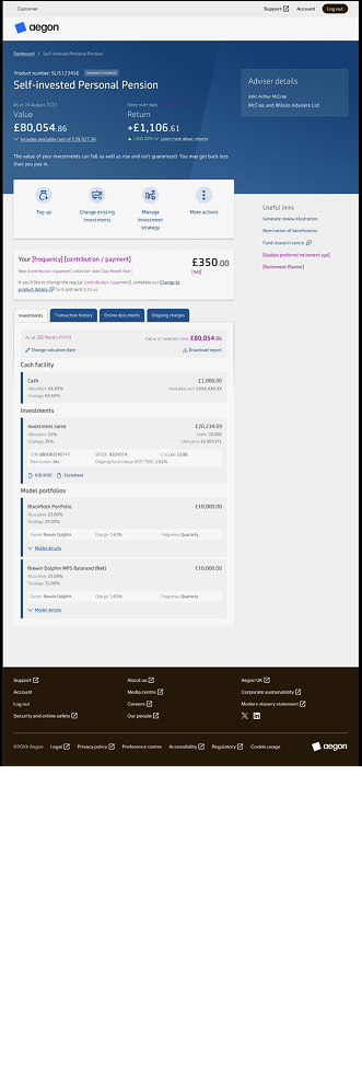
Core page transformations
In research, our users reacted with horror to our as is dashboard designs. They were too technical-looking, too stark, too serious.
Fixing this came in two parts: making the actions easier to understand, and bringing more tools and features into the experience to feel more welcoming, tailored to customer needs.
Outcome
Unfortunately, our work had to be paused due to large-scale organisation restructuring. While we can't currently deliver the value as planned, there is a clear, well-documented series of design files and business artifacts awaiting a future team to pick up the work if desired.
Pausing the project, while disappointing, allowed me to refine my UI spec work, as I had to ensure the new component designs could be picked up and shipped even if no one attached without relying on current stakeholders. The Specs (formerly EightShapes) were a great tool for accomplishing this, as when I had clean components I could automate some of the more repetitive documentation, allowing me to spend my time on detailed work like accessibility tagging.
Measuring user experience
"This really feels like it's been designed for me, by someone who understood exactly what I need"
- Recurrent interview theme from users of the old platform seeing some updated screens of the new platform for the first time
While we couldn't get the project live, speaking to users and hearing that they feel seen - and how rare that feeling is in financial services - has proven to me the value of this project and its outcomes.
Insights
- Simplified key transaction (money in) with an average 25% reduction in user steps and 2-3 page reduction in length to increase money in volumes
- Increased user understanding of the journey steps and core pages earning a comprehension score of 84%
- Drastically decreased user concerns about not belonging into an experience they'd be enthusiastic to use
What I learned
This project required very fast paced, simultaneous design work. In order to keep to the timelines, I had to learn quickly when to delegate work, and when to deprioritise and do quick benefit/risk analyses . It was great getting to work so close with customers again, being able to hear honest feedback and critiques of their experience and make them feel seen.