Jump To
Project overview
Discovery
Design
Results
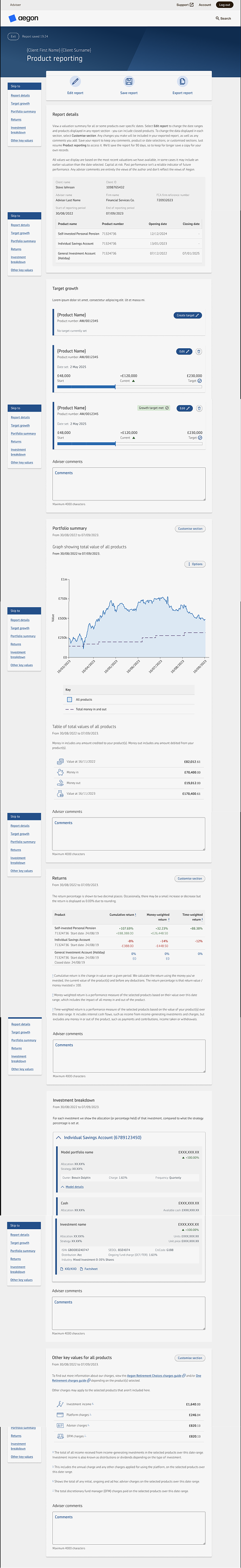
Client Reporting
How do we rebuild Aegon's client reporting capabilities, and position it as a market-leading tool for financial advisers, all in 12 months?
No time to read the full case study?
My Role
Senior UX Designer
UX Researcher
Product Owner (for report redesign project)
Team
Product Owner
2 Business Analysts
2 Full Stack Developers
2 Testers
Other stakeholders: Risk, Legal, Compliance, Brand
Timeline
12 Month Programme
MVP → Iterative Enhancements
Impact
Monthly users grew
328 → 1300 (+300%)
Reports generated
7,255+
Backstory
Financial advisers rely on annual reviews to explain investment performance to their clients.
Following a major platform migration, Aegon lost its reporting capability entirely, leaving advisers without a way to visualise performance during these meetings.
This created three risks:
- Advisers moving to competitor platforms
- Reduced transparency for advisers clients, who are also Aegon customers
- Potential friction with Consumer Duty regulations
The goal of this project was to rebuild reporting capabilities and long-term position Aegon as a market leader in adviser reporting tools.
Project roadmap

Discovery
Early insights
During phase 1, we launched multiple moderated and unmoderated feature preference studies to understand our users’ expectations.
Our key discovery was there are two types of financial advisers looking to use our tool: explorers and finders.
Explorers
Explorers want raw data and the power to play with it, expecting strong visuals, customisation opportunities, and the ability to see the different stories data can tell. They're more likely to spend longer on the page and make use of the full tool suite.
Finders
Finders are advisers and their accompanying ParaPlanner staff who will benefit from a new reporting tool but want to use it for immediate fact finding and data exports. Even in a positive experience there goal is getting in and getting out as fast as possible.
Early insights
Research inputs
As a new product, research was critical for gaining market appetite and prioriting where to start.
- 6 rounds of user interviews at various design stages
- 4 unmoderated usability studies
- 2 comprehension studies on language barriers
- 2 accessibility-focused usability study
- 1 card sort for feature prioritisation
What this revealed
We have two distinct user types
Our explorers and finders were equally prominent, but had different needs, behaviours and expectations.
I needed to get out the design box
All our testing with existing design system components paled in comparison to bespoke builds. Our reporting tool needed to look, feel and behave differently
More data, more problems
Users wanted everything at there fingertips, but were concerned how they would then navigate all the data they desired
Building a backlog
With building a tool from scratch, there's an unlimited number of feature combinations we could have delivered. To determine what was essential to an MVP, and then where I wanted to take the project long term, I needed data
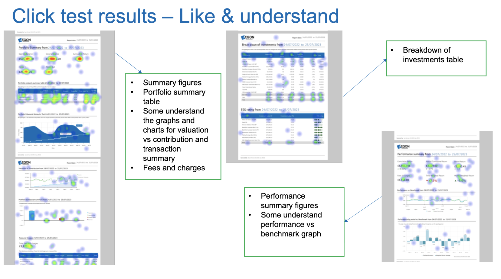
I created a very low fidelity design showing the majority of features we could possibly deliver. This was then taken to the user panel for surveys and card sorts where users selected what there ideal reporting tool would contain. I then aggregated this data into a visual guide, showing what we had to have, what was nice to have, and what was low return for effort
“Having something visual makes finances feel more tangible. When planning for the future, it can feel very speculative”
-Key finding through customer interviewsCustomer insights
Not only does the tool need to work for our advisers, but it also has to work for customers who wish to self‑serve. Customers' needs were very different from advisers' despite similar goals, and an emphasis on clean, visual-heavy design became apparent as it reduced cognitive load and the intimidation of engaging with financial planning.
Design process
Phase 1 – get an MVP live
Based on our research findings and available technology, I delivered a lean MVP to address the immediate need for basic reporting functionality.
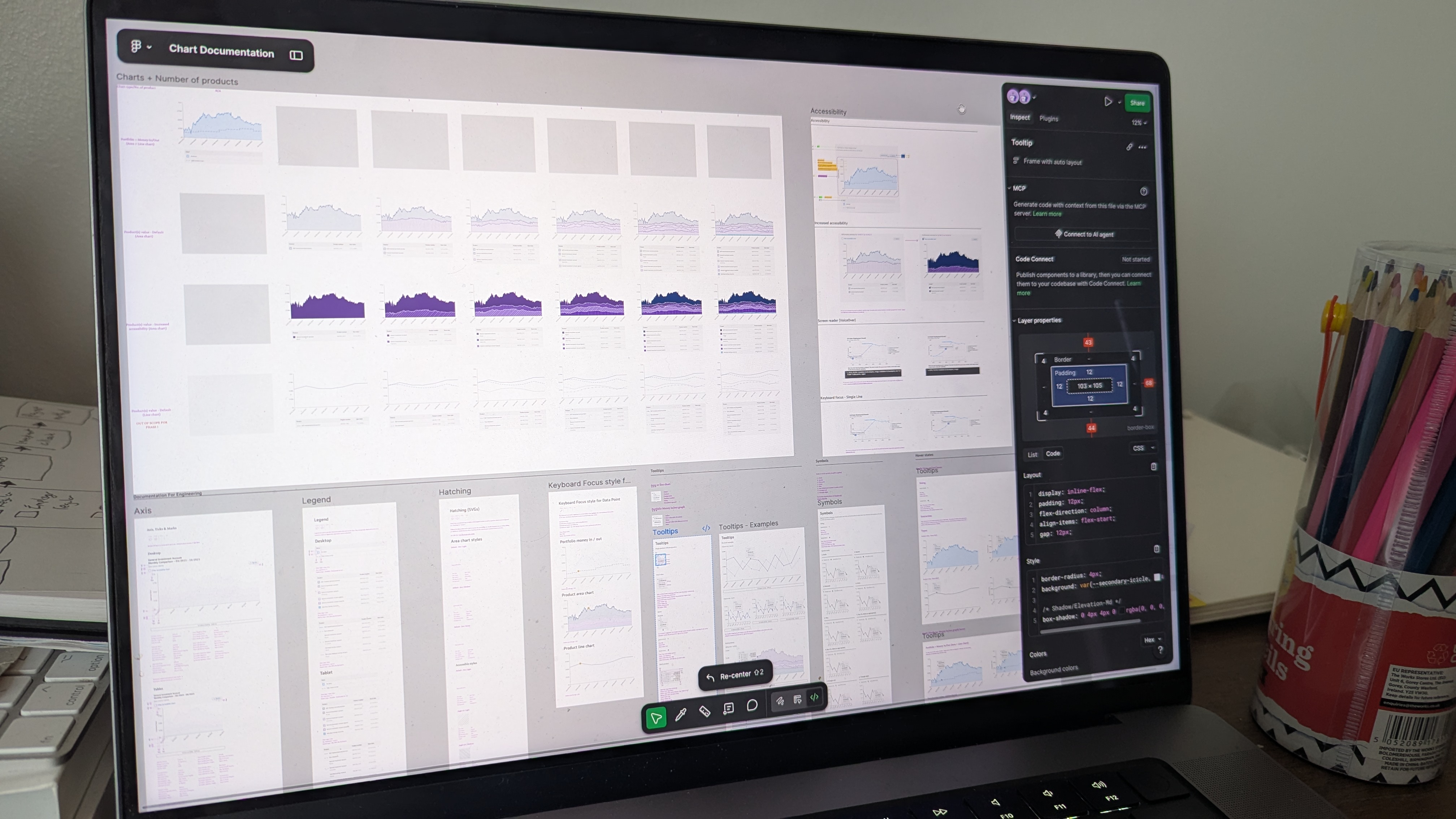
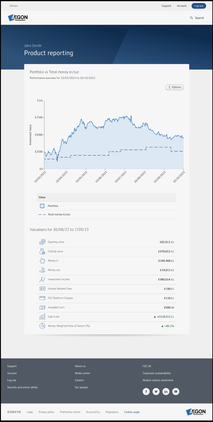
The biggest learning of getting the MVP live was finding a charting library that met our design needs, was technically easy to work with, but most importantly met our strict accessibility guidelines.
After some robust internal testing and more user research, I landed on HighCharts, which could be configured to our design system and offered excellent baked-in accessibility such as sonification (turning data into audio), raw data exports, and screen reader configurations. To ensure it was suitable, I even mocked up a few HTML prototypes utilising it for user and internal testing to make sure it met our needs and performed as expected, no matter the data.
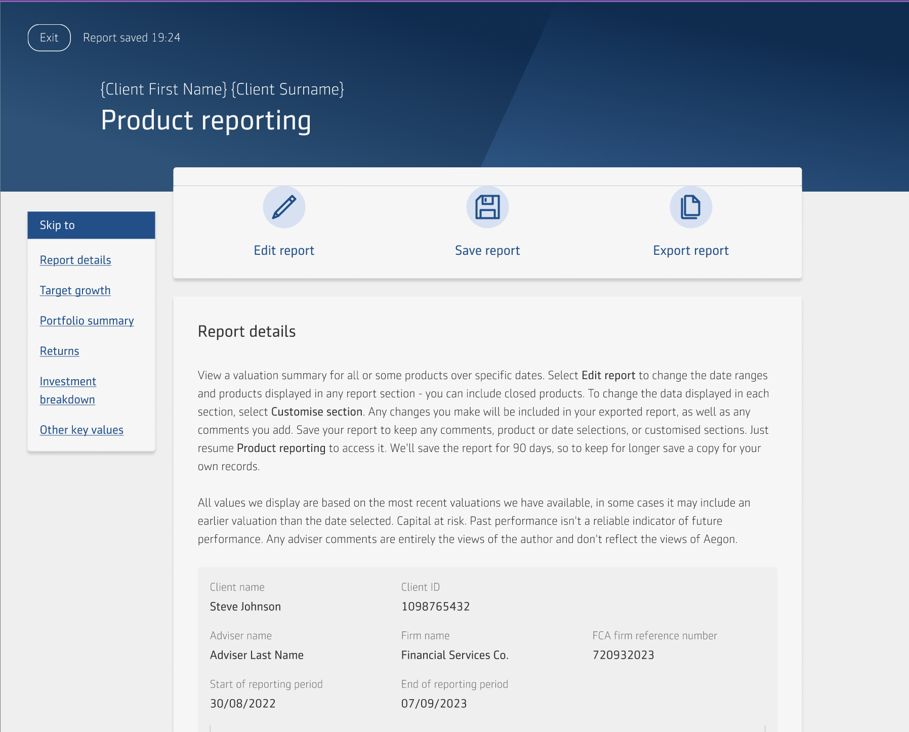
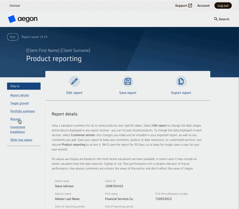
Improved navigation
With the ambitions of our project, I knew the contents of the page would grow and grow, making it a taller, denser experience to navigate. To combat this, and to satisfy our "Finder" user's need of getting straight to the information they're looking for, I implemented a "sticky nav". This is a fixed menu detailing all the categories in the tool, taking affordance from the contents page of the report to closer align the experiences. This feature was robustly tested and redesigned to ensure it was responsive to all device sizes, and did not impair accessibility by logically fitting the reading order and appropriately scaling with screen magnification.
This relatively simple user experience enhancement saw a reduction in user intent, user's previously took up to 1 minute to find the data section they logged in to view, but this was reduced to approximately 5-10 seconds.
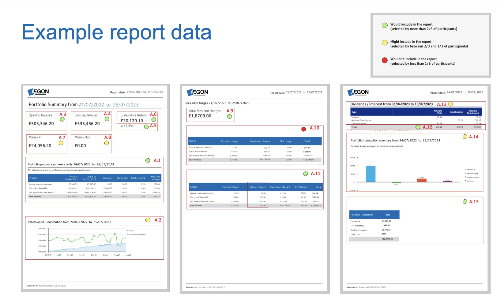
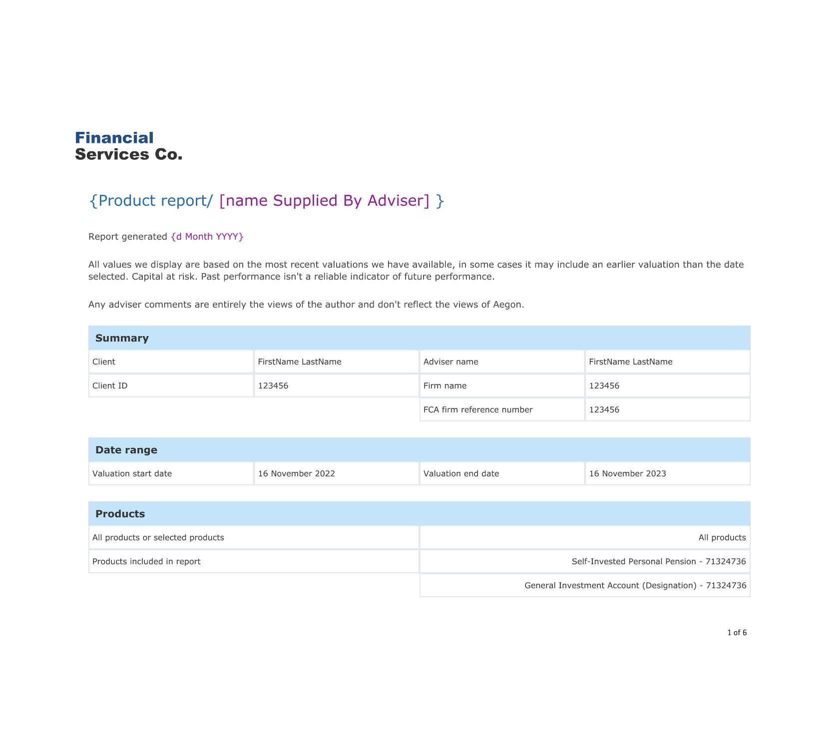
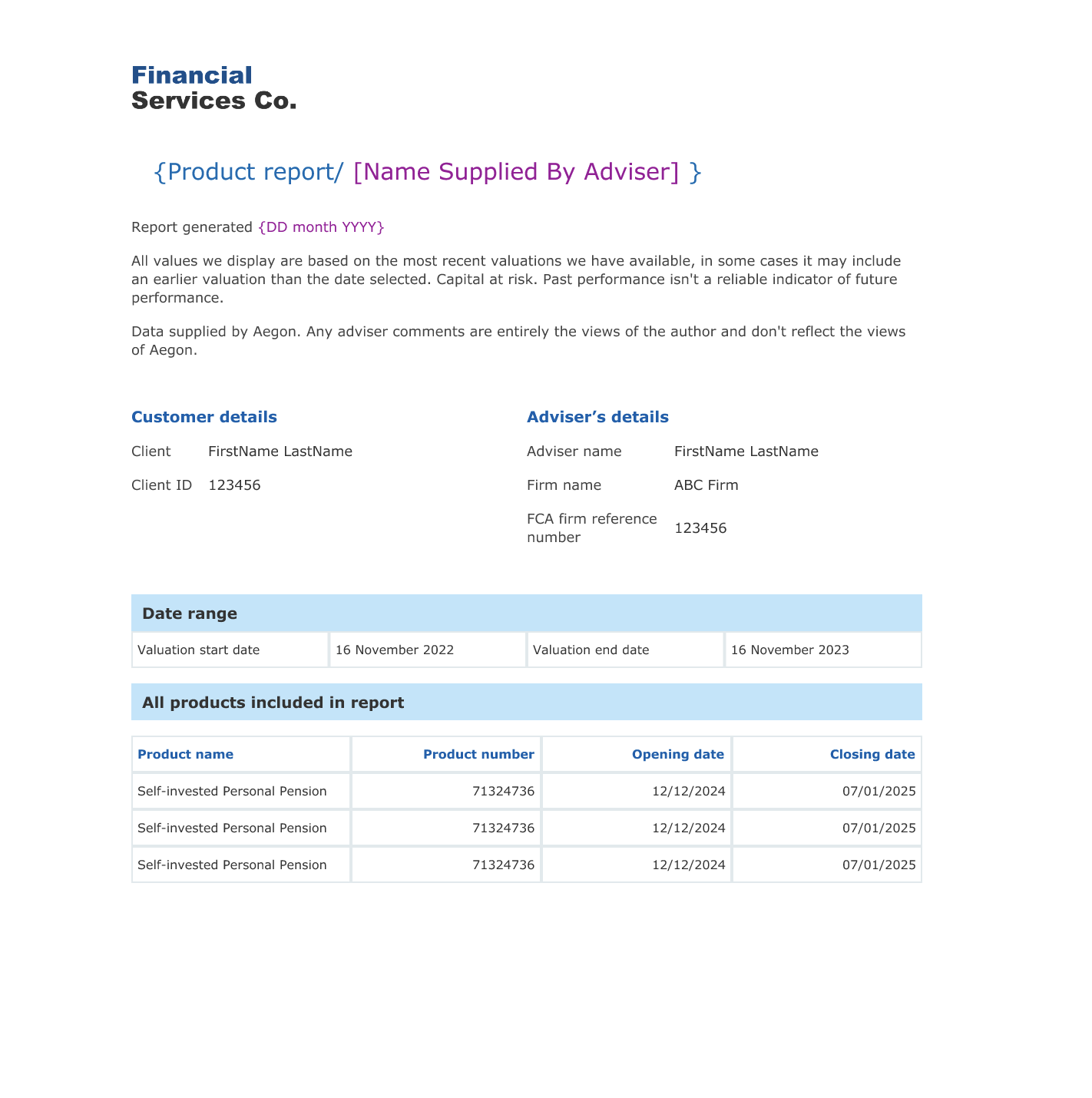
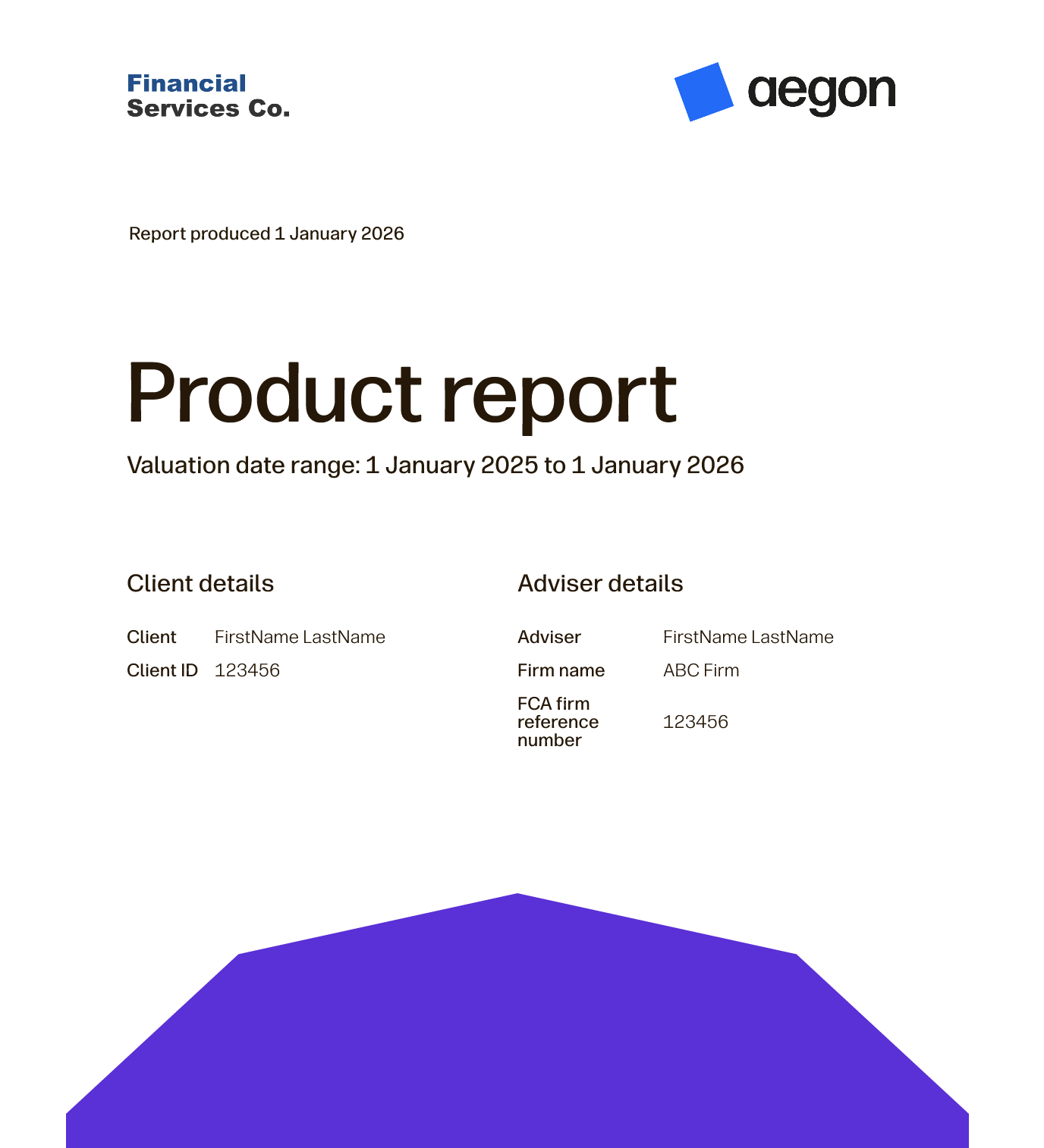
Exported report
A consequence of the lean MVP was we had to launch with our most basic report design. Immediately via our continuous research and business development partners, we received an influx of feedback that the report output was a letdown compared to the digital experience.
While not a typical UX task, I ran solo designer for this project and served as proxy Product Owner as I was best placed to understand the exact requirements.
As the company was undergoing a major rebrand during this time period, I had to liaise closely with the brand team to ensure I was using the latest approved assets, and work closely with the developers to understand our current PDF software limitations
Based on internal technology feedback, rather than a big bang report redesign, I opted to deliver it incrementally. The biggest challenge was moving from a portrait to vertical layout, so developers completed this first in the old style. They then incrementally added new features we were missing like a cover page and contents while I liaised with brand on the final look and feel. By the time the team were ready to implement and release the final design, all the known technical hurdles had been overcome ensuring a smooth delivery.
This change has been very well received internally and externally, as it was a relatively cheap project to run but instrumentally changed the user experience for the better, leading to us being described by users as market leading in the reporting space.
New Feature - Target growth
Originally, we had benchmarking on our roadmap, which was reliant on a 3rd party data provider. This initiative had to be dropped as costs proved prohibitive. Rather than admit defeat and tell our users we couldn't deliver this feature, I revisited research and noticed an expression of interest in a "Personal benchmarking idea".
To validate this, I ran a series of moderated and unmoderated tests with users, understanding why they would want to benchmark in general, what sort of financial goals clients most often held, and how this fit into the reporting ecosystem
It became clear that users often had measurable financial goals such as prove benefit of a strategy by growing 3.5% in one year or reach a pension pot of £100,000 by age 35 .
Financial targets often feel speculative and intangible, so if they could visualise goals and include them in annual reports it would be a big benefit to clients and financial advisers.
This project took a fair few iterations to get right and get a business case approved, and required working closely with senior leadership alongside my own sprint team to sell the value of this feature.
Eventually we were able to compromise and land on a new section allowing advisers to enter a £ or % target for their clients' investment products. They could set a target for each product the user held, then see every time they logged in how the client's current product value or growth compared with this target, and amend if required.
This compromise met the research need of visually tracking performance against a personal benchmark, whilst limiting it to a smaller MVP-style delivery to ensure market receptiveness before investing further.
Target Growth AI powered demo
Using AI and Figma make prototypes like this were a great tool for working with senior stakeholders on scope defining, as I could quickly turn on and off functionality to see how it affected the overall experience.
12 months of transformation
Insights
- Following 1 year of iterative development, we grew from an average of 328 monthly users to just show of 1300 (approximate 300% user growth in one year )
- Number of reports produced using the tool 7,255+
- The ability to break enhancements into a clear, iterative backlog allowed us to release a total of 17 enhancements to the tool since the original go live early 2025
- We built a loyal user base of advisers switching entirely to our reporting services, abandoning their own in-house or competitor-owned solutions.
What I learned
This was a good project for developing as a designer, and learning to think not only about the user but the overall business picture. Over the year I was able to work with two talented product owner's who taught me the importance of evidence based decision making, and encouraged me to push back if I could justify it.
I once again unlocked the power of befriending your developers as a designer, as I could quickly get validation on approaches and complexity long before it had the chance to become an issue.This is a project I'm incredibly proud of, as the user value is clear, and it's been a pleasure helping it evolve.