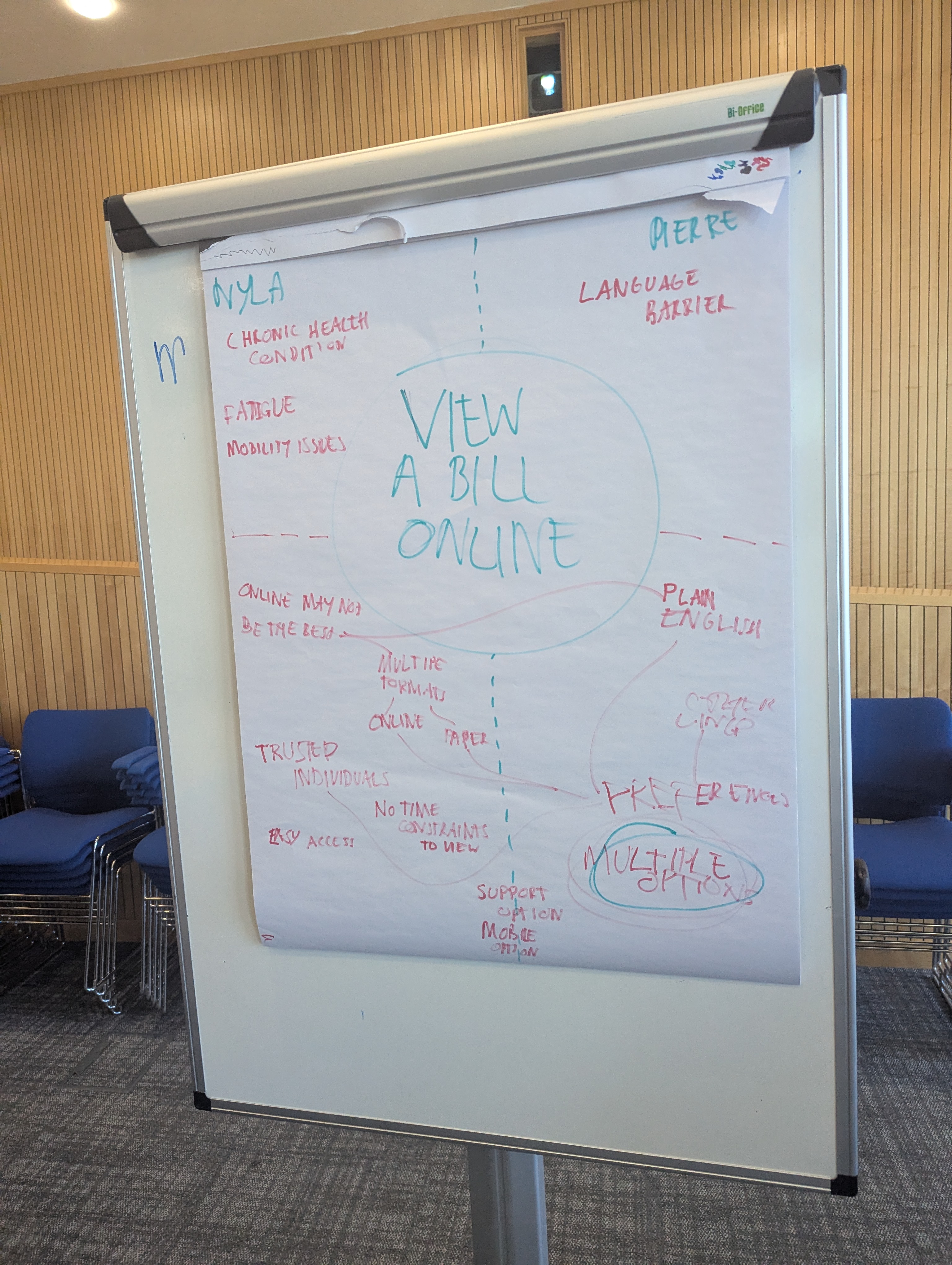
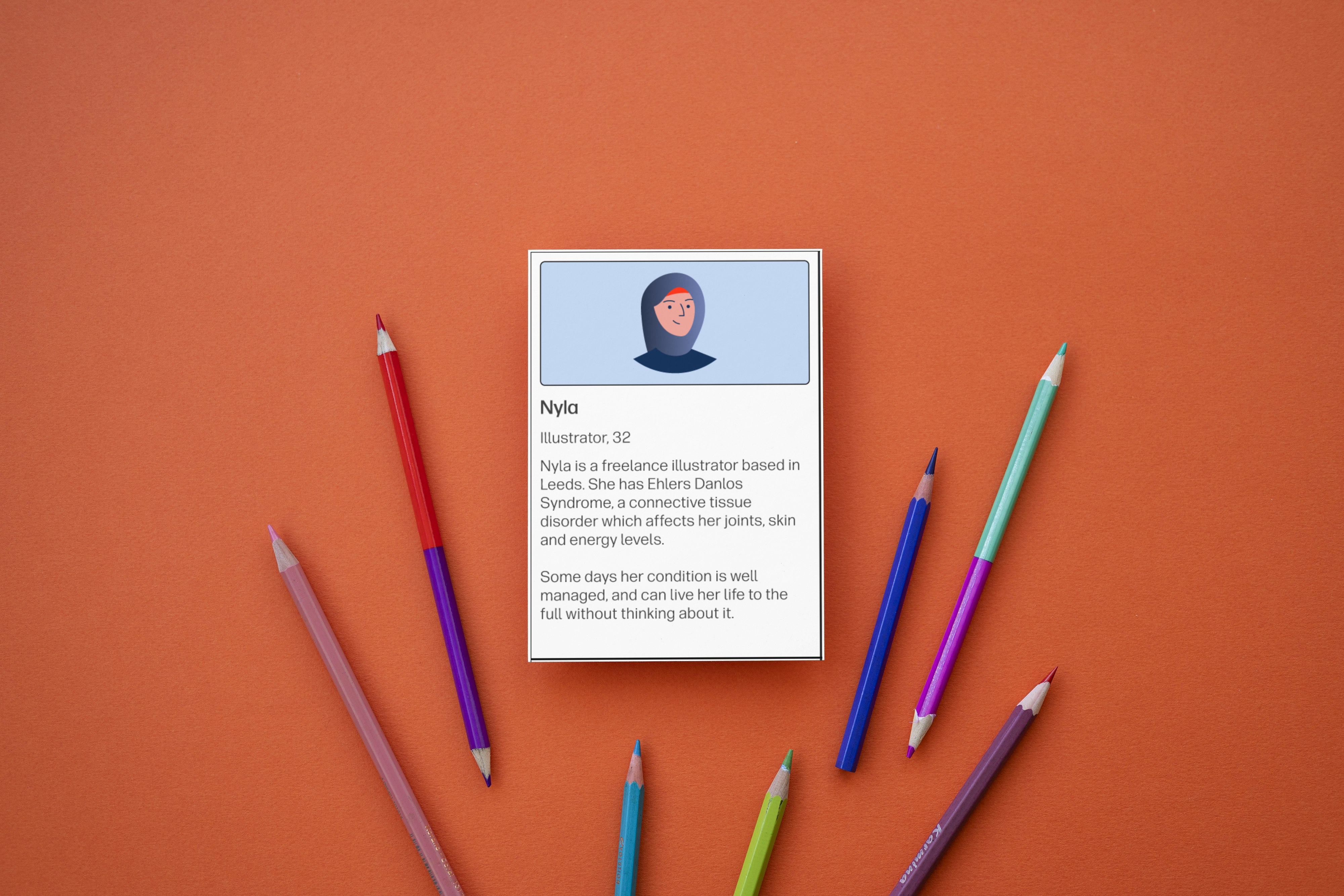
Jump To

Project overview

Planning

Findings

Results

Accessibility and Inclusive Design

Accessibility audit slides, inclusive persona cards, and workshop artefacts used to identify barriers and educate teams

Turning low-priority legacy digital experiences into a catalyst for inclusive design change.

No time to read the full case study?

I conducted an accessibility audit of a legacy service, using inclusive personas and assistive technology testing to uncover usability barriers. By translating WCAG issues into human stories, I helped stakeholders understand the impact and sparked wider internal conversations about accessibility.

90+ issues identified
100+ internal requests
Workshop for 30 colleagues

Backstory

During a quieter period at work, my manager asked me to investigate one of our legacy services and identify opportunities for improvement.

The service was a contact form attached to our public website. It was aimed at users of our legacy software and had very low traffic, so appetite for improvement was low.

I had no specific brief to work to, simply familiarise myself with the service and develop a proposal of what I would tackle first if given the chance.


I chose to make personas a central theme of this project so I could stay accountable to a broad range of user needs.

Planning

Testing plan

Methods

  • Heuristic evaluation to get a baseline of the experience
  • screen reader testing
  • "No mouse" keyboard testing
  • Mobile phone testing

Testing goals

  • Understand what support topics are available
  • Complete a "Change my personal details" request
  • Complete a "Nomination of beneficiaries" request

Inclusive personas

Accessibility testing

Visually there were already plenty of findings, but the key focus for a project like this had to be examining the flows - seeing how successful, or unsuccessful, I could be in completing desired actions.

I set out a few basic, common tasks which I could then test with each persona in mind. This allowed me to explore further tools such as mobile responsiveness, screen reader configuration and keyboard navigation.

Not only was this a fantastic way to uncover issues, but it really helped cement my accessibility knowledge through gaining some more lived experience using assistive tools and technology

    From the lens of each of my personas I wanted to discover how easy/difficult it was to:
  • Navigate the available topics
  • Complete an inquiry about nominating beneficiaries
  • Update my personal details
-->

Findings

How to present an accessibility audit?

In my week of exploration, I uncovered around 90 different issues with the portal.

The findings varied widely, from buttons with no visible focus state and page titles labelled simply as "container" to misleading language

This was far too much to take to the stakeholders in charge of this service. I also had to be mindful I was not dealing with technical stakeholders, but business leaders focused on return on investment into their propositions.

Because the personas had been so useful in uncovering issues and adding human context to the metrics, I chose to weave them throughout the presentation.

I was no longer telling them, for example, that an incorrect page title failed WCAG 2.4.2 at A level , but instead weaving a tale about Sam who opened a new tab to find their plan number and can no longer spot which of their 10 tabs open contains the form they were completing.

I got the biggest impact when presenting as I screen recording of the current experience, which included over 1 minute of the screen reader announcing the existing alternative text of an asterisk denoting a mandatory field.

Example audit findings

Post-audit activities

The slide deck containing my audit, while originally intended for a small group of immediate stakeholders, gained traction internally as an example of how we should be addressing accessibility concerns and why it matters. To date, I've received over 100 access requests from senior leaders throughout the business to help them understand our issues and empathise with them, including members of the C-suite.

I've also shared this presentation with other departments including technology and product management to help them better understand some of the accessibility concerns, and prevent them from being repeated in the future


Since presenting my audit, we've seen much earlier UX involvement in initiatives, as we've proven the value of our input early on for preventing rework like this.

Next steps

To keep momentum going, I took the personas, the most requested part of my audit, and turned them into easily shareable flashcards highlighting different users and their needs. I was able to collaborate with our vulnerable customers lead to understand some more niche vulnerability scenarios affecting our contact strategy, to build a more robust persona list.

The idea behind the cards was simple and functioned a bit like a Top Trumps, allowing anyone interested to pick a card at random and learn a bit more about a vulnerability they might not have thought about before.

The cards were designed to work both as a standalone learning activity, but also to be incorporated into some accessibility and inclusive design training planned.

Accessibility flashcards

Illustrated portrait of Nyla

Nyla

Illustrator, 32

Nyla is a freelance illustrator based in Leeds. She has Ehlers-Danlos syndrome, a connective tissue disorder which affects her joints, skin and energy levels.

Some days her condition is well managed, and can live her life to the full without thinking about it.

Illustrated portrait of Maya

Marcia

Teacher, 54

Marcia is a teacher in Greater Manchester, where she lives with her husband and teenage sons. She fell victim to an online scam last year, which saw her lose over two thousand pounds.

She has struggled with a great deal of shame after the scam, and feels very foolish.

Illustrated portrait of Daniel

Pierre

Gardener, 39

Pierre moved to Edinburgh from Lyon, France with his wife and children three years ago when his wife received a promotion.

He speaks conversational English, but struggles with the written language. He particularly struggles with formal language on official documents, and gets easily frustrated trying to use websites with too many words.

Inclusive design workshop


At our most recent team day, featuring 30 participants across design, research and management, I took the opportunity to run an inclusive design training workshop inspired by my findings.

I designed a hands-on accessibility training workshop to help teams experience the barriers different users face, building skills from empathy rather than from textbooks.

This workshop involved splitting into teams and receiving two persona cards, detailing realistic and relatable barriers like language, chronic health or money worries, and a common situation they had to design for.

Figma screenshot showing a component example

Figma screenshot showing a component example

Insights

  • 90+ accessibility and usability issues found in production legacy code
  • 100 access requests from across the organisation for my audit findings

  • Learnings transformed into a workshop for 30 UX researchers, designers, managers and senior leadership

What I learned

Although this began as a side-of-desk task, it became a valuable learning and development opportunity. It proved that there is always more to learn about accessibility and inclusive technology. It also helped me understand some organisational resistance to accessibility enhancements; it's less about not seeing value and more about not fully understanding the scope, impact and benefits of it.